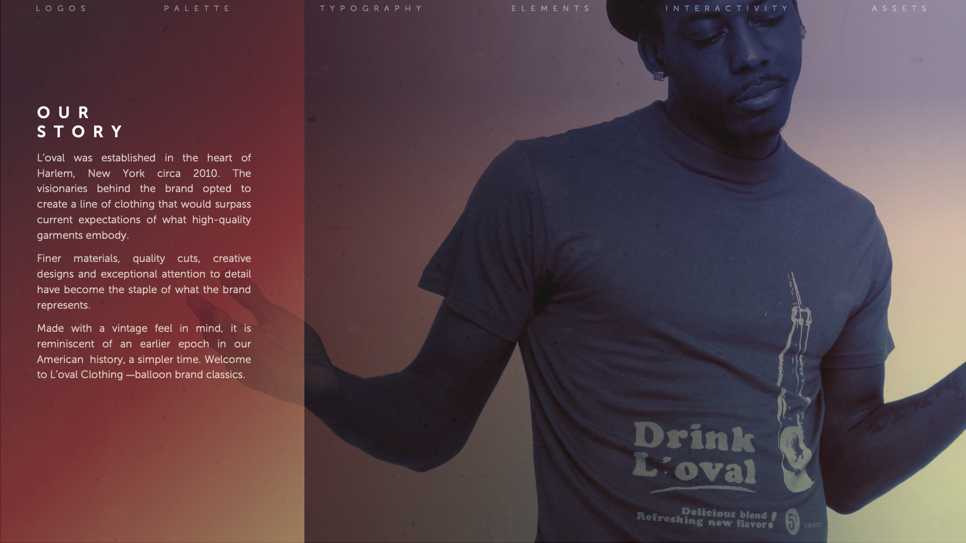
The ask
This was a solid front-to-end project. Art direction, branding, digital executions, clothing design, packaging, photoshoots and presentations were all required.
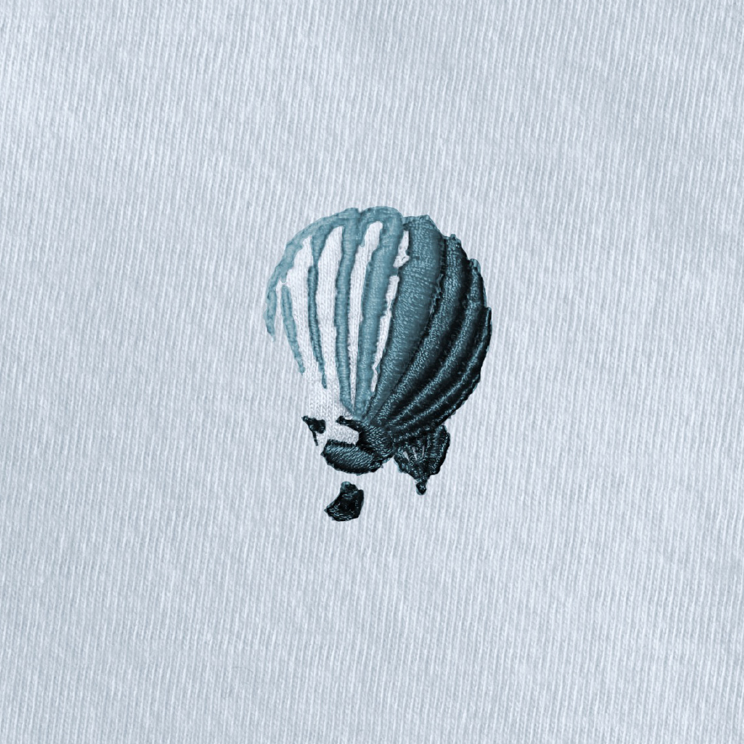

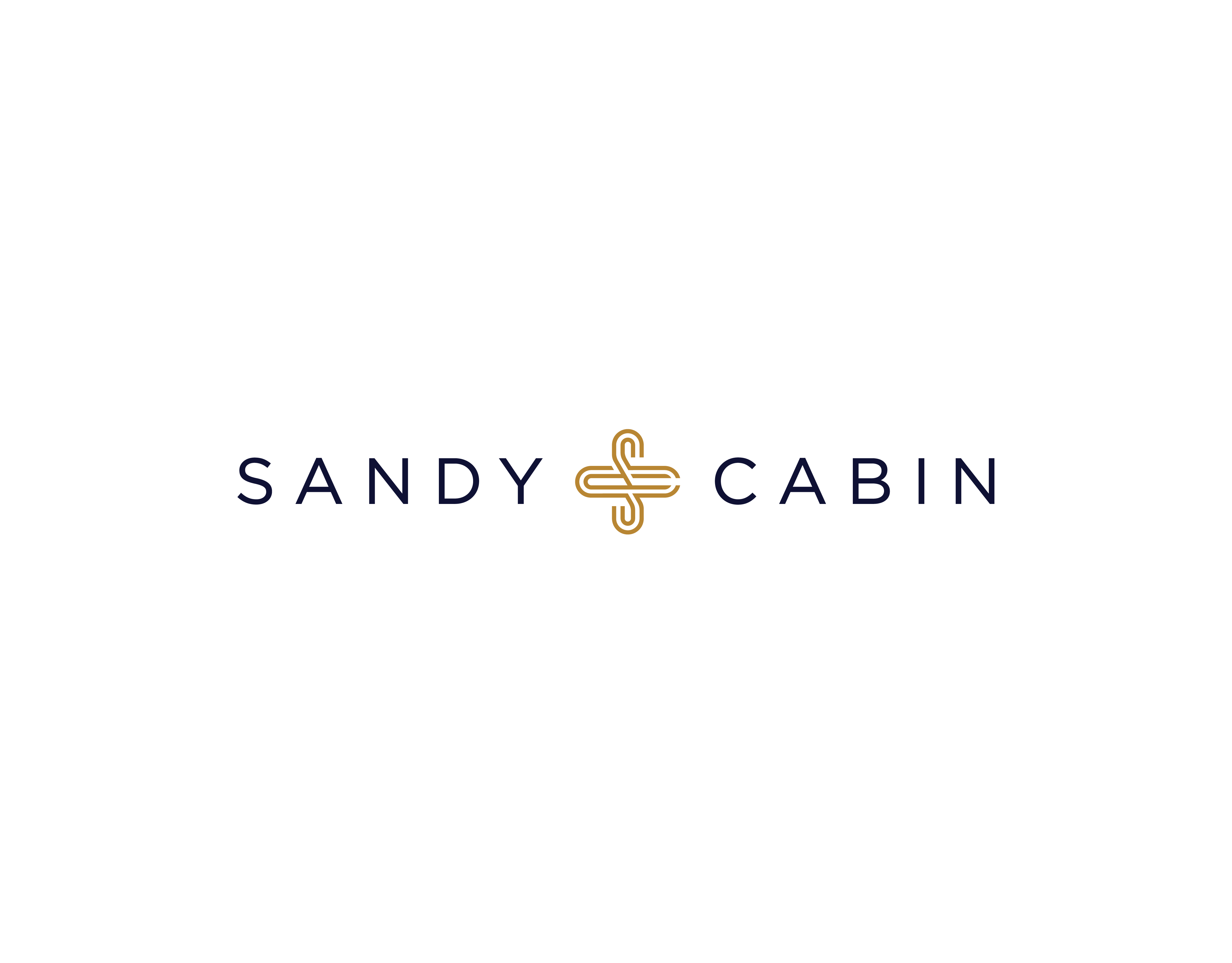
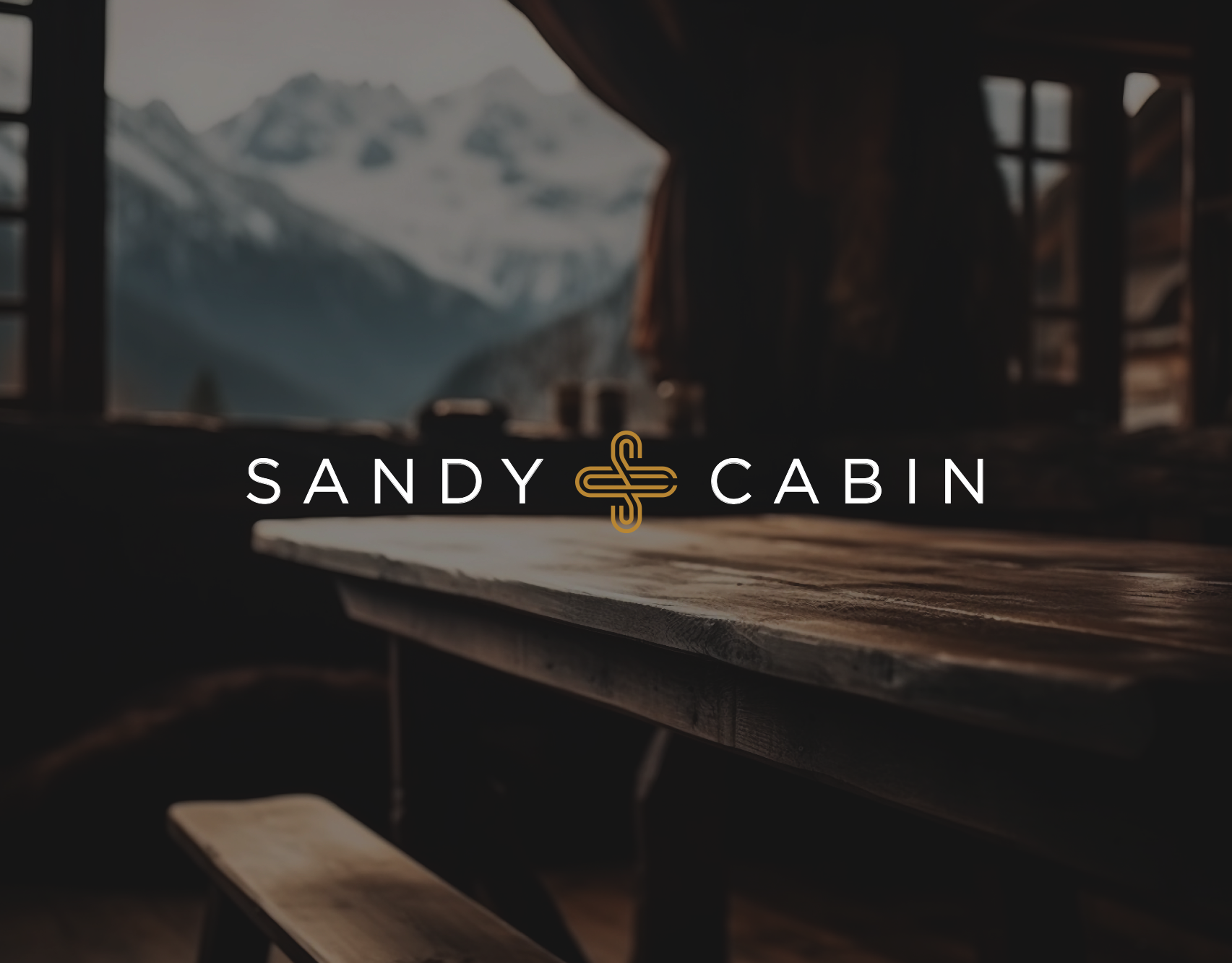
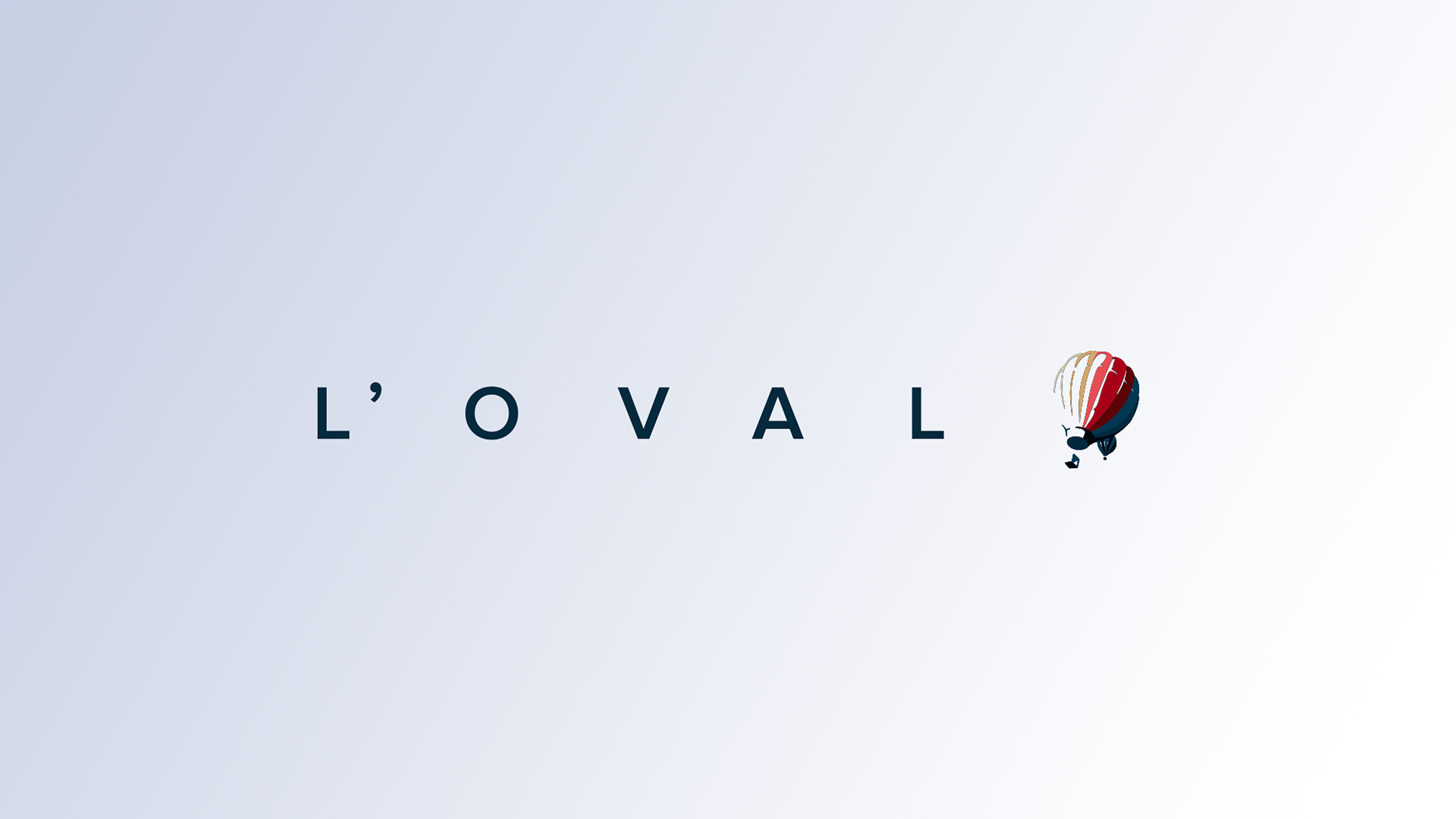
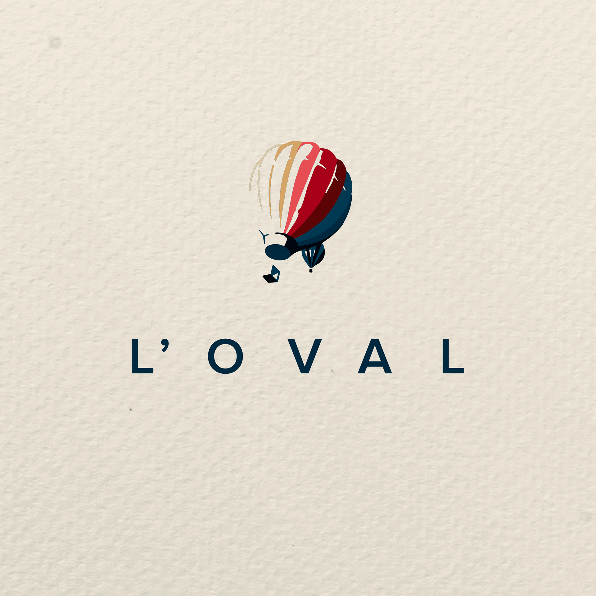
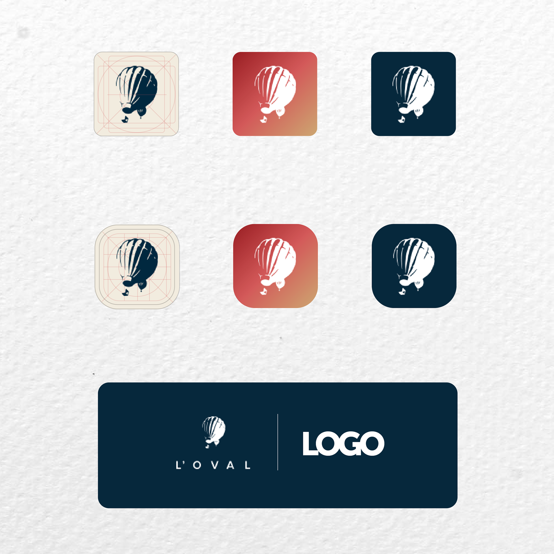
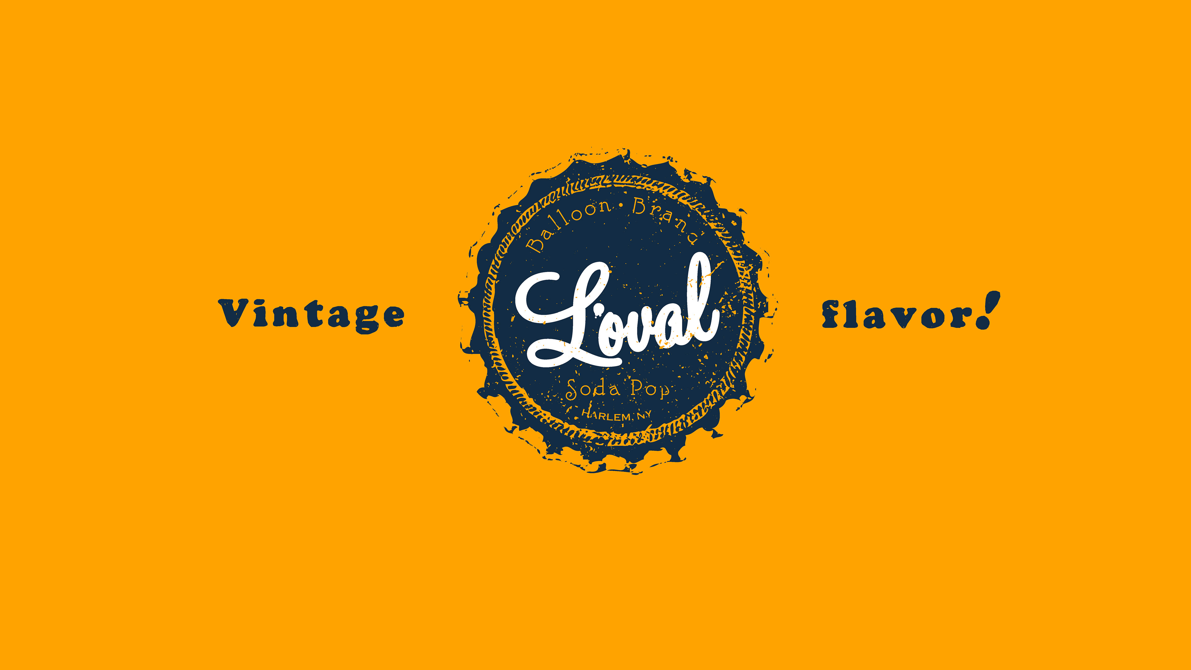
Logos
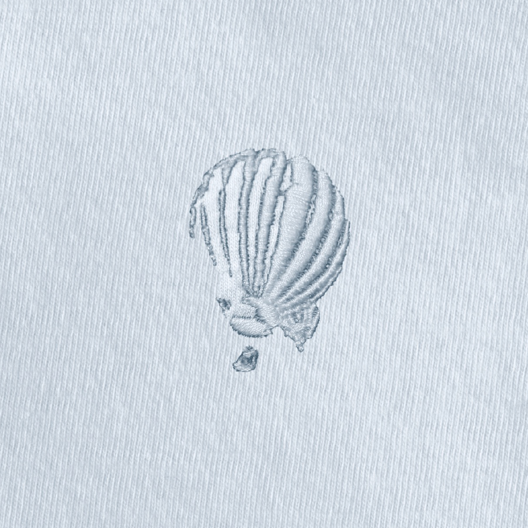
The balloons were almost organic as a solution. They were the result of words that would be used to define the brand, such as freedom, strength, patriotism, and virtue. The icon and the wordmark were developed to evoke this set of emotions. A flat logo was created, as well as a multi-paneled alternative, used for embroidery.
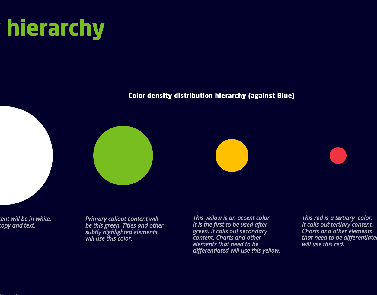
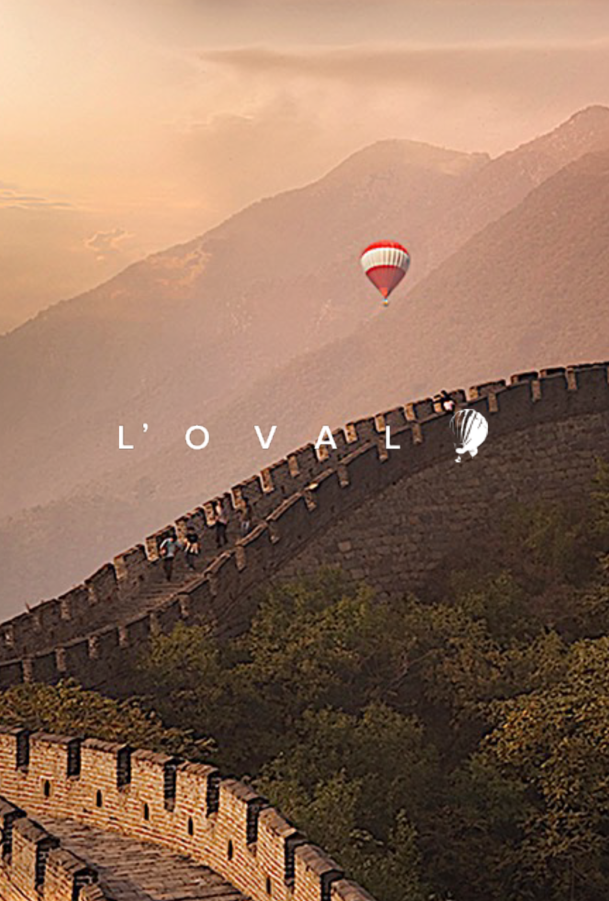
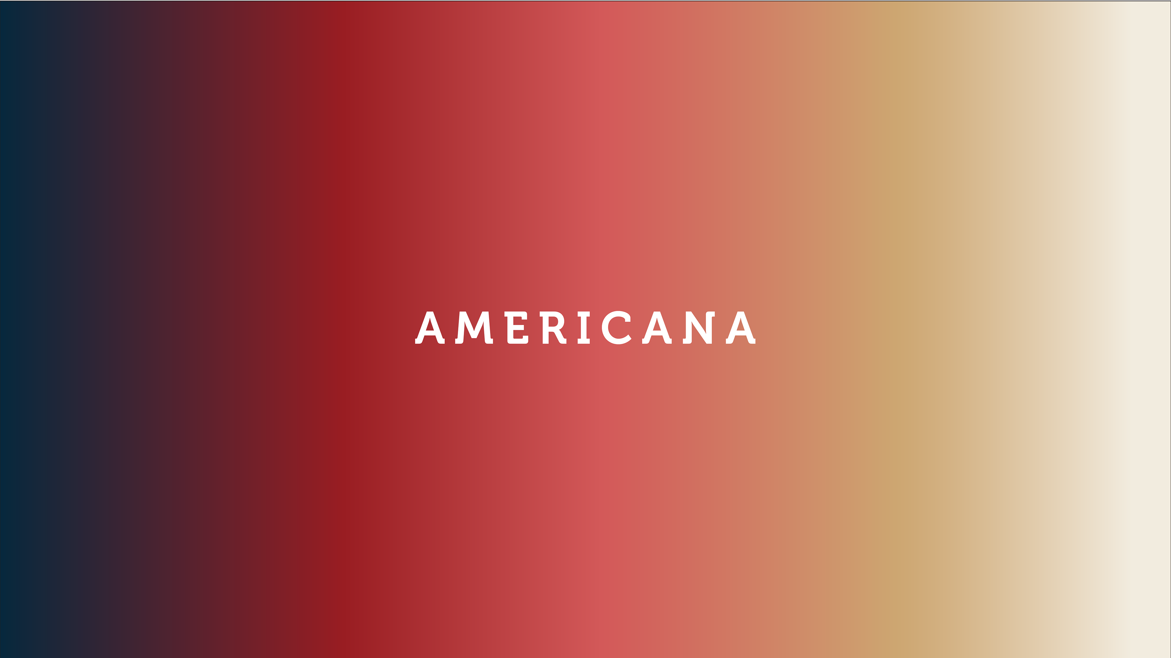
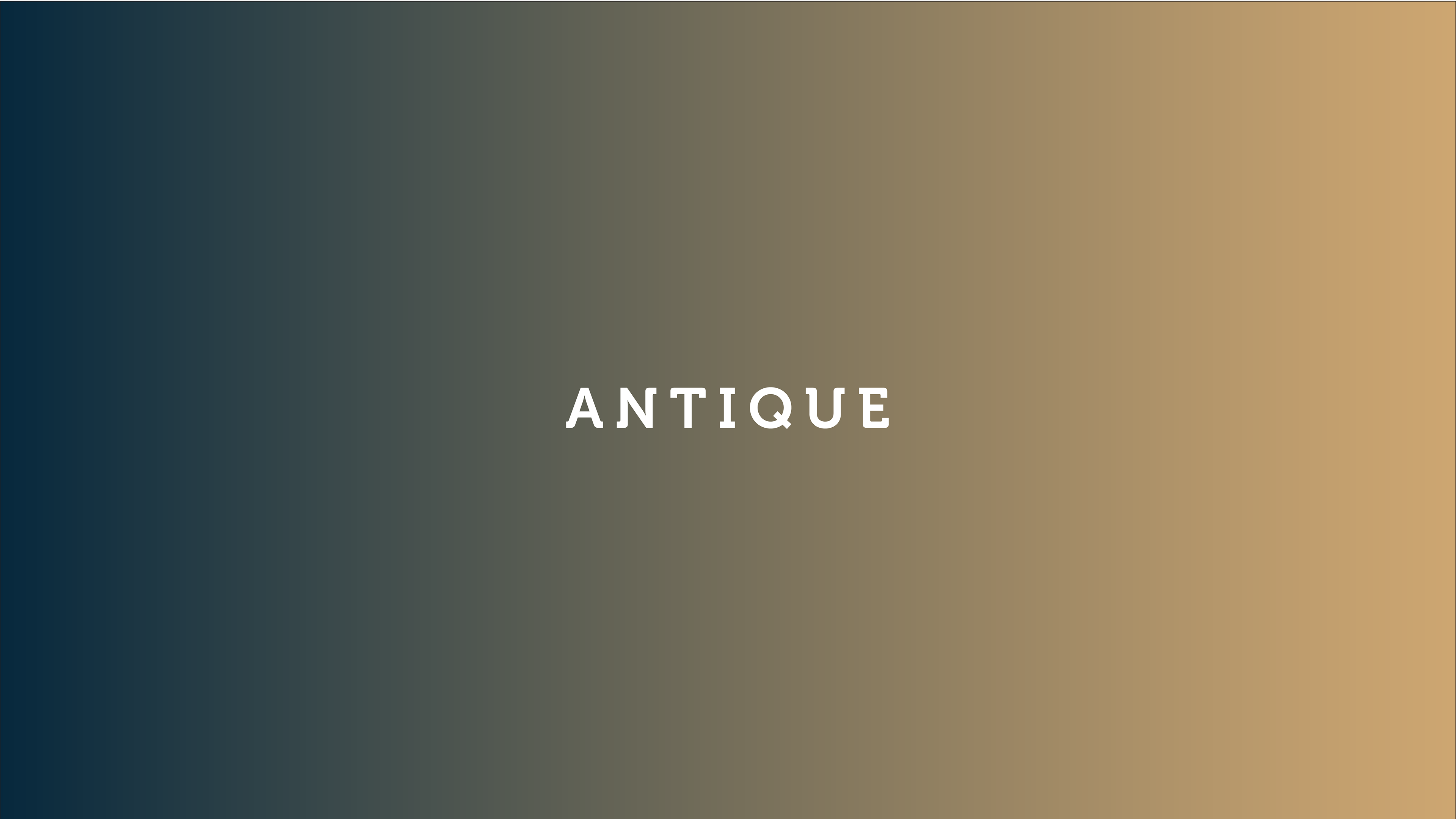
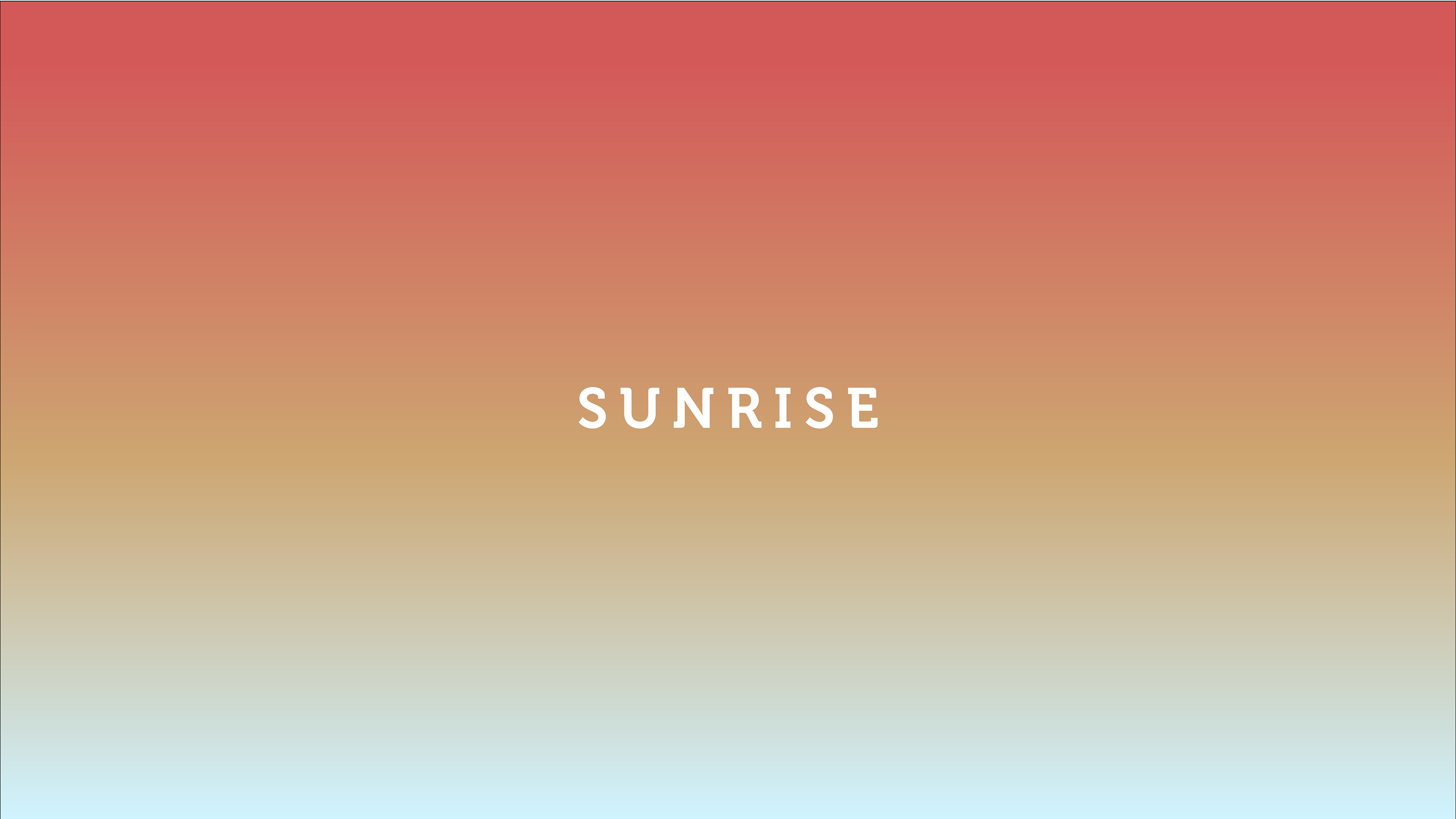
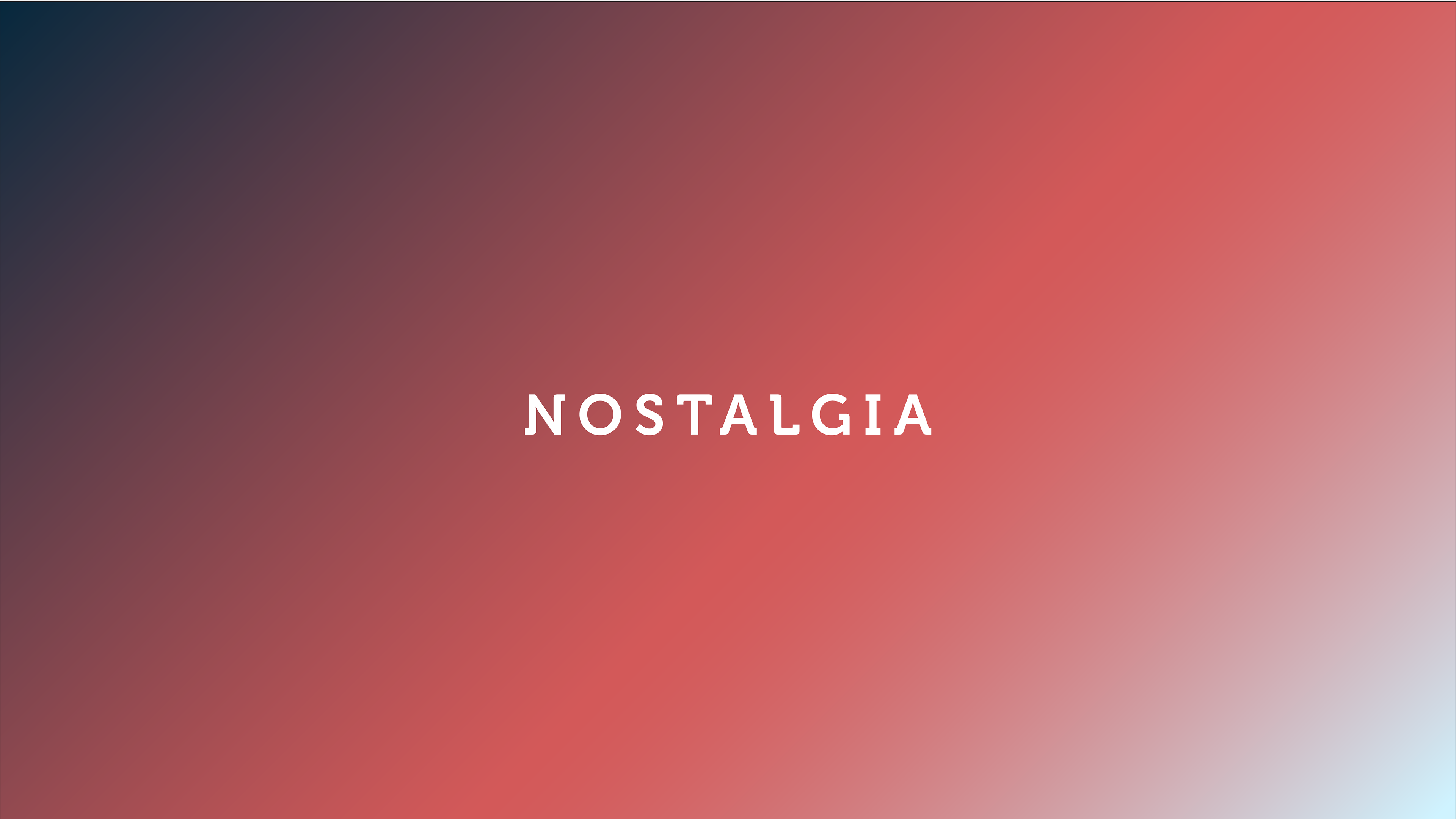
Colors
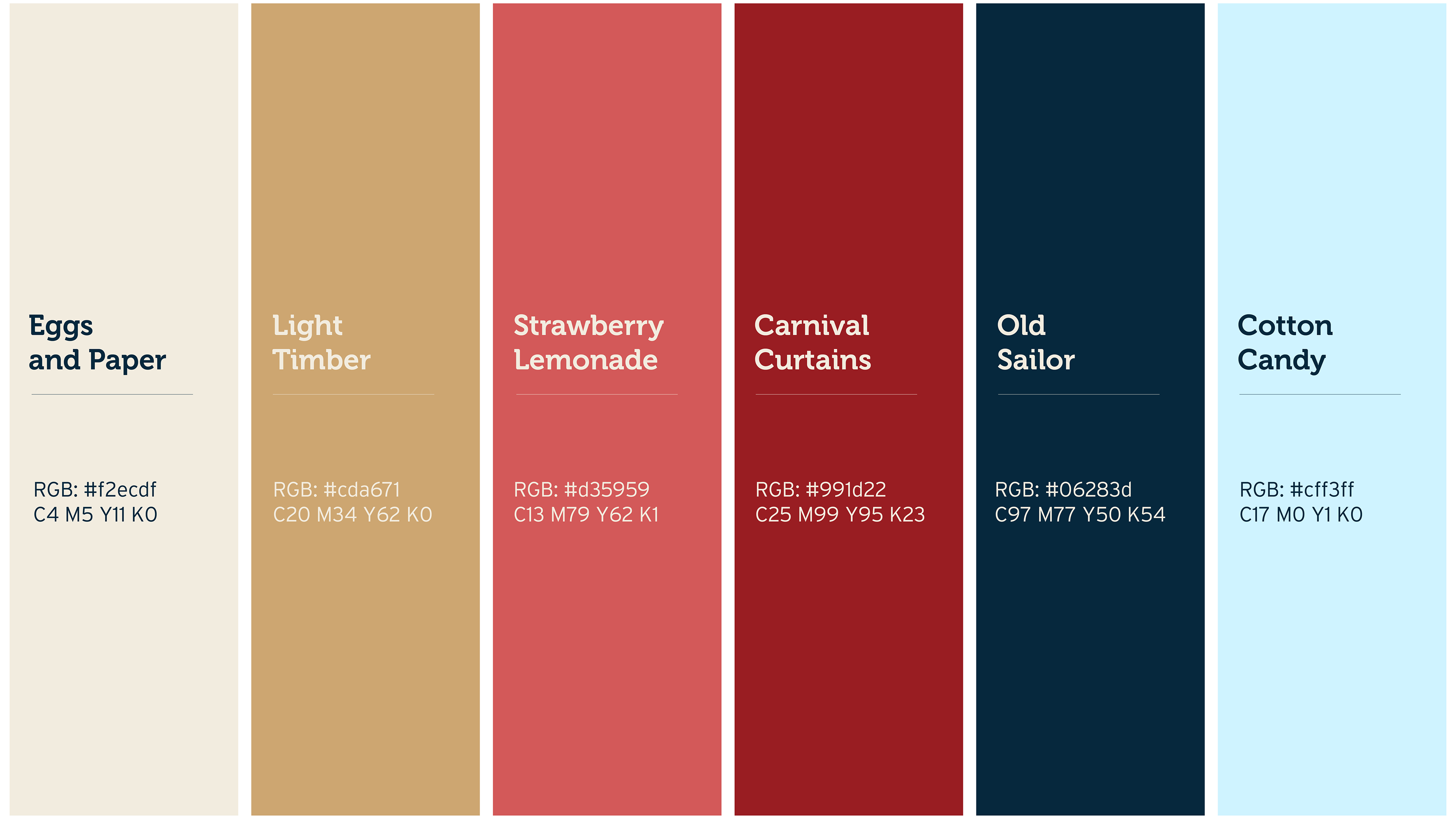
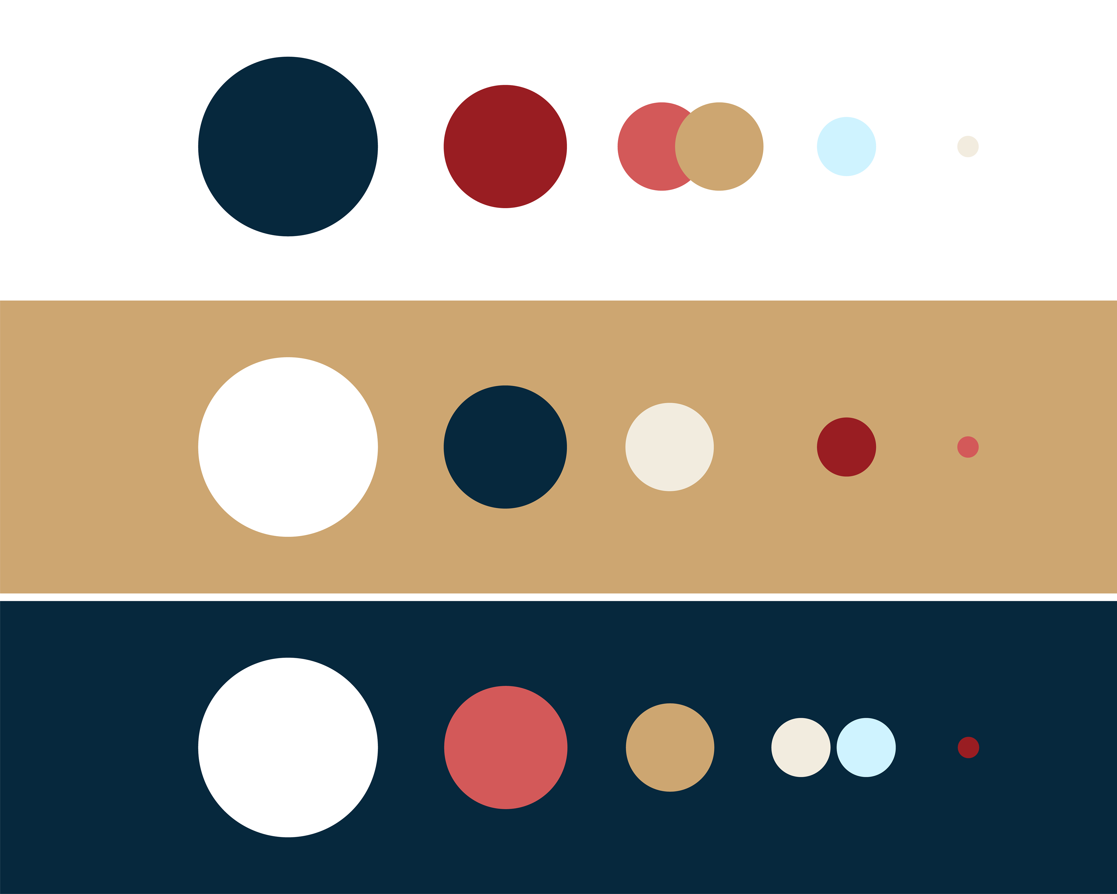
I love this palette. It feels rustic, aged and American. The tan and beige directly feed off the worn hue older objects tend to have. The red and blue were based on the American flag, but a bit darker and more solidified. The lighter blue was meant to let the eyes breathe and feel airy and free.


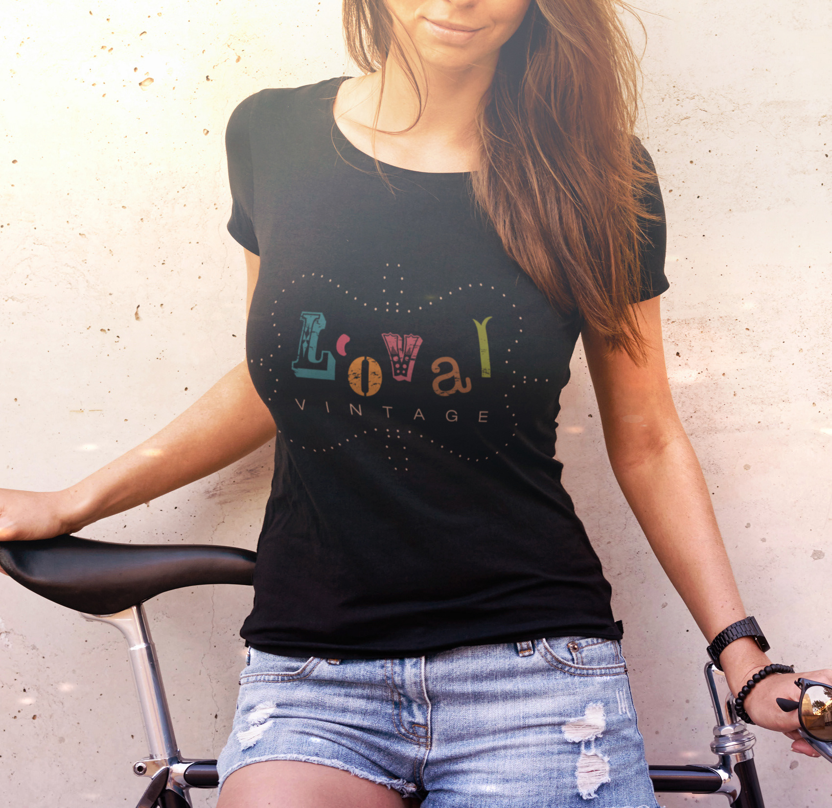
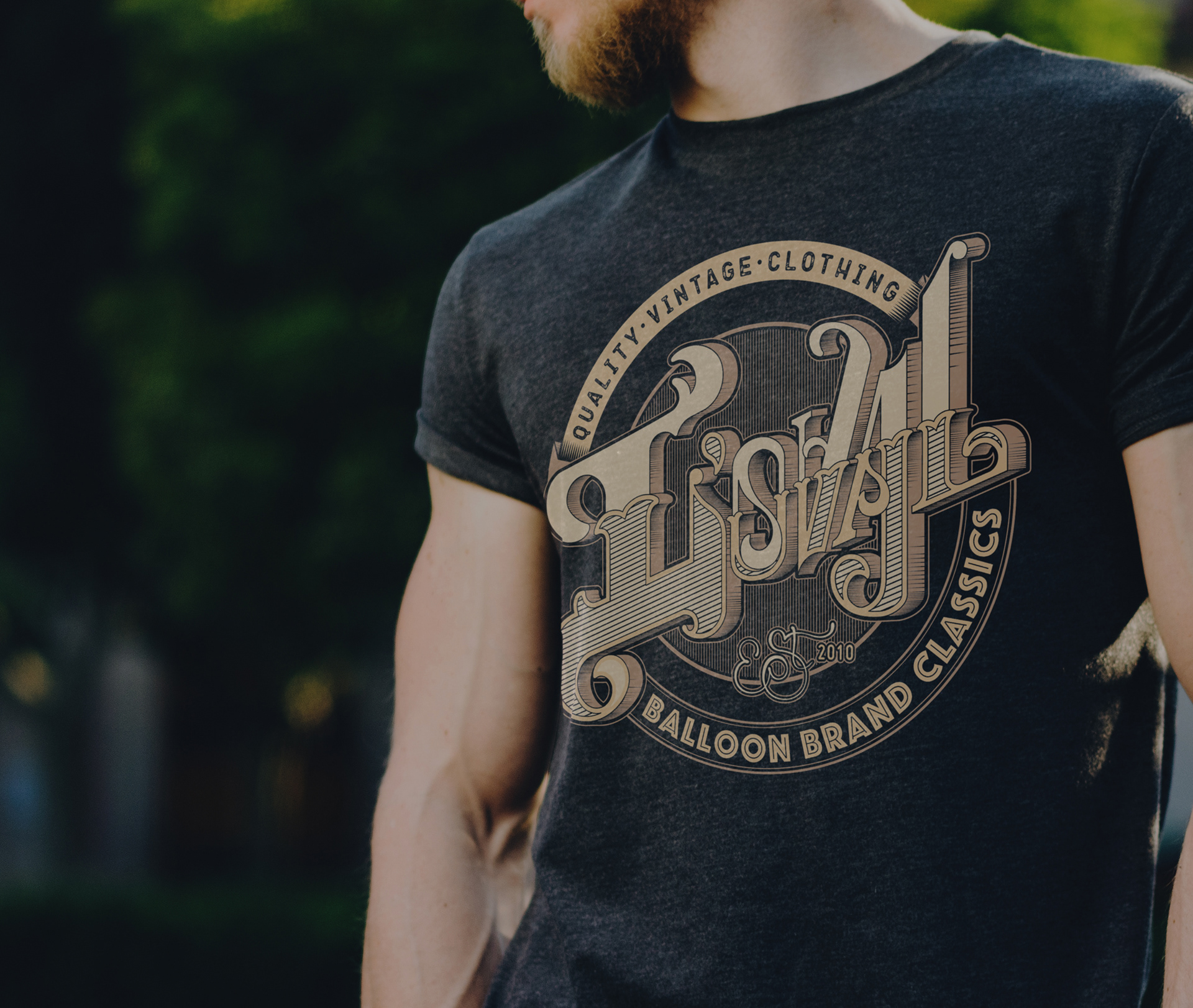
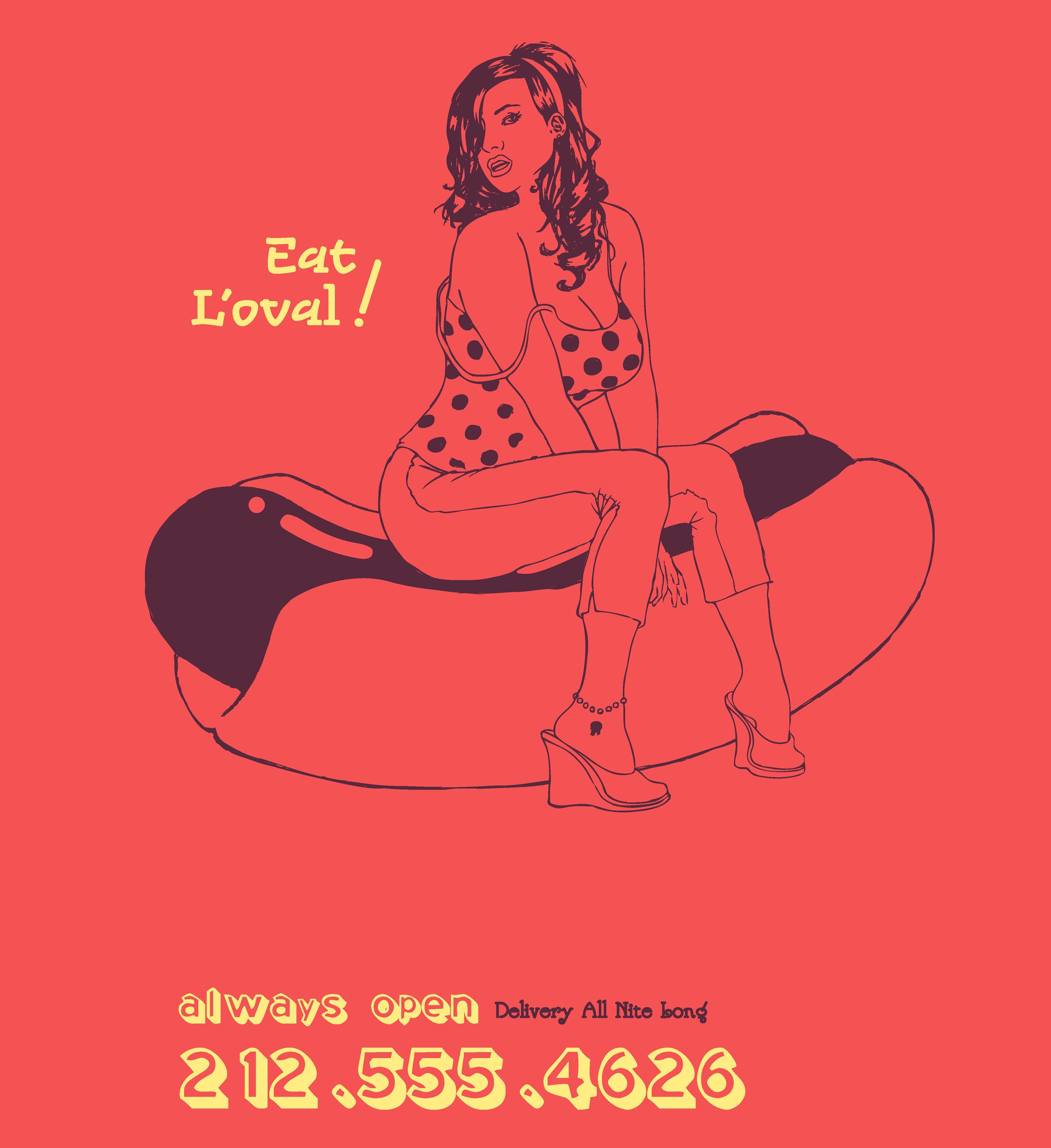
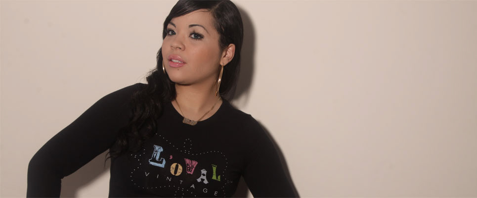
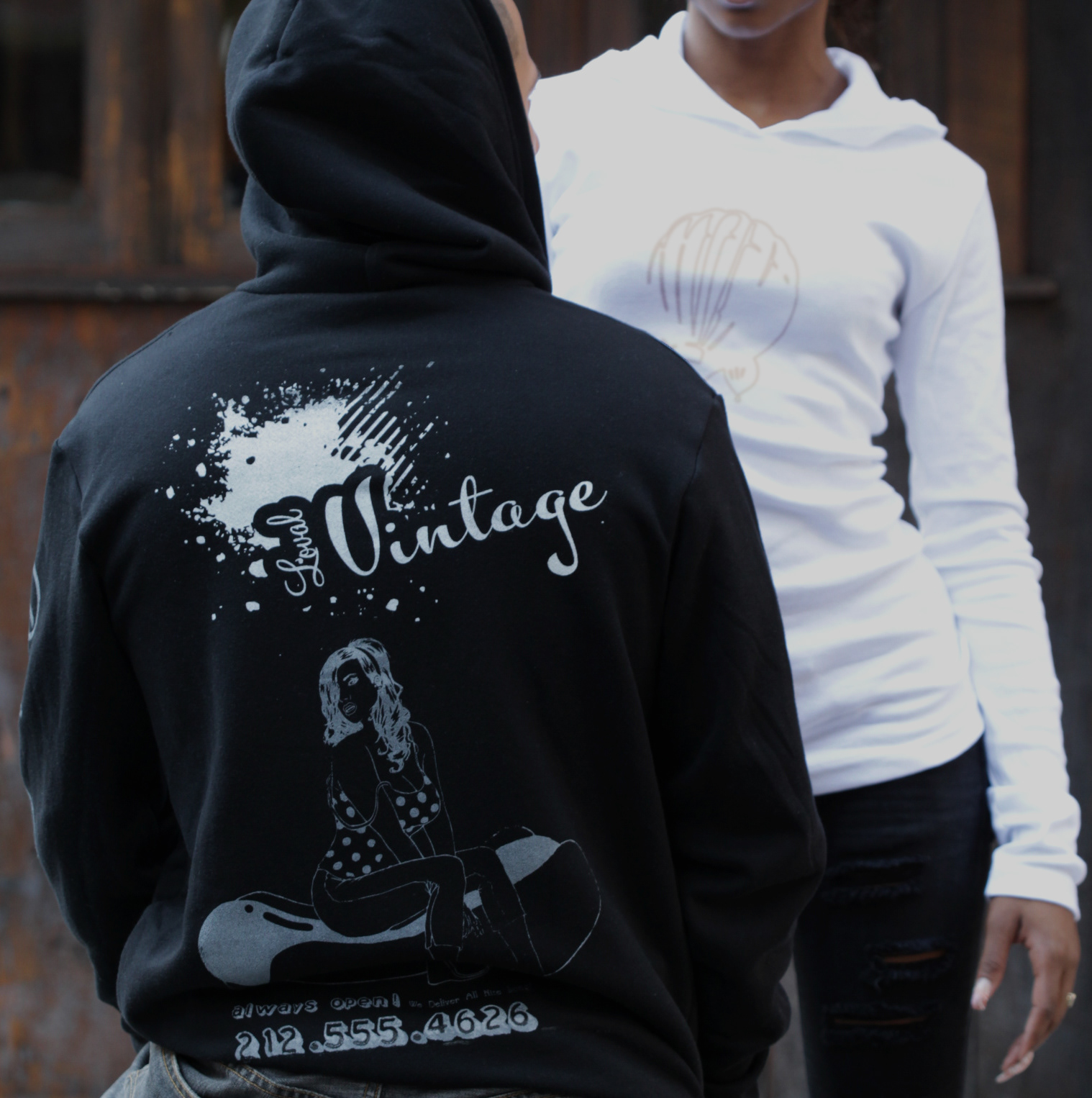
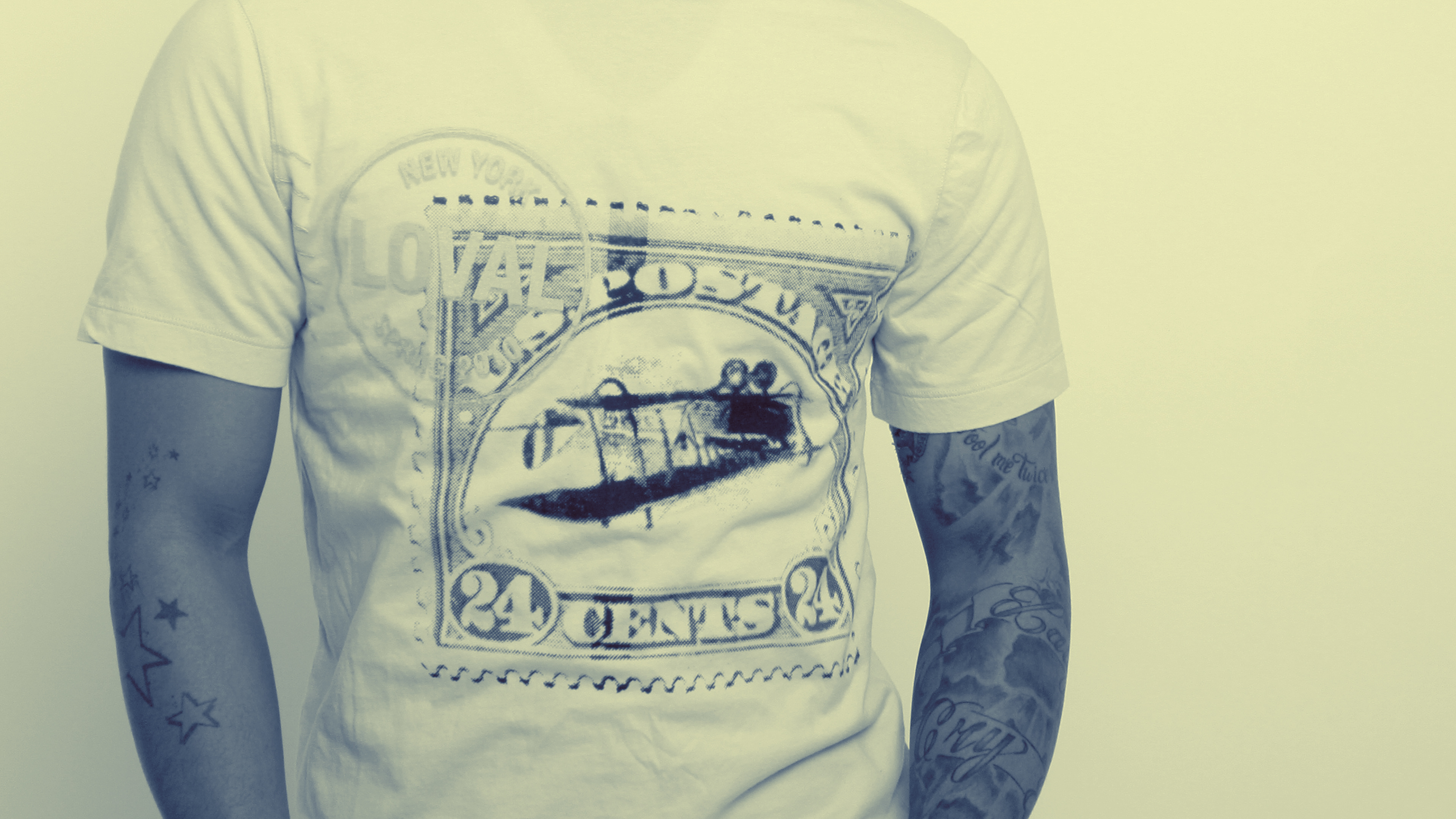
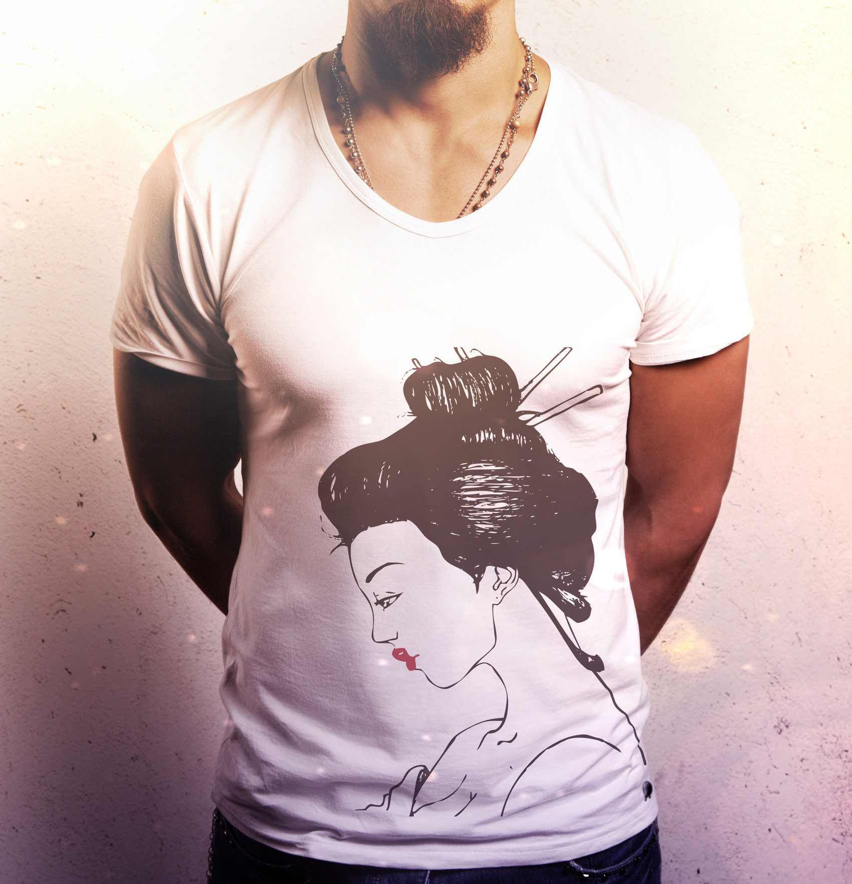
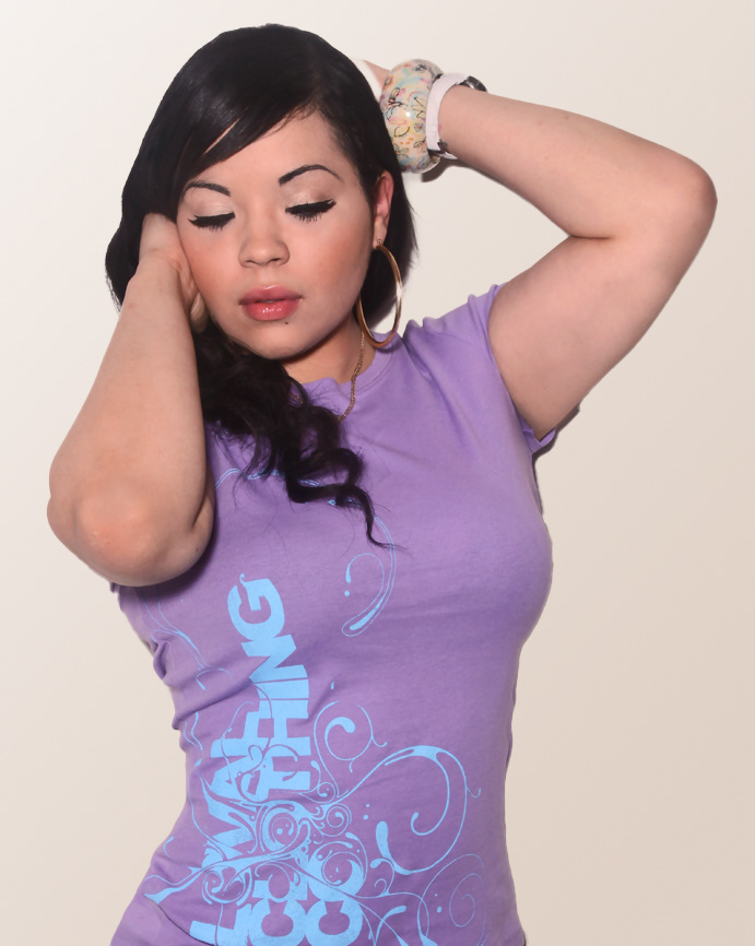
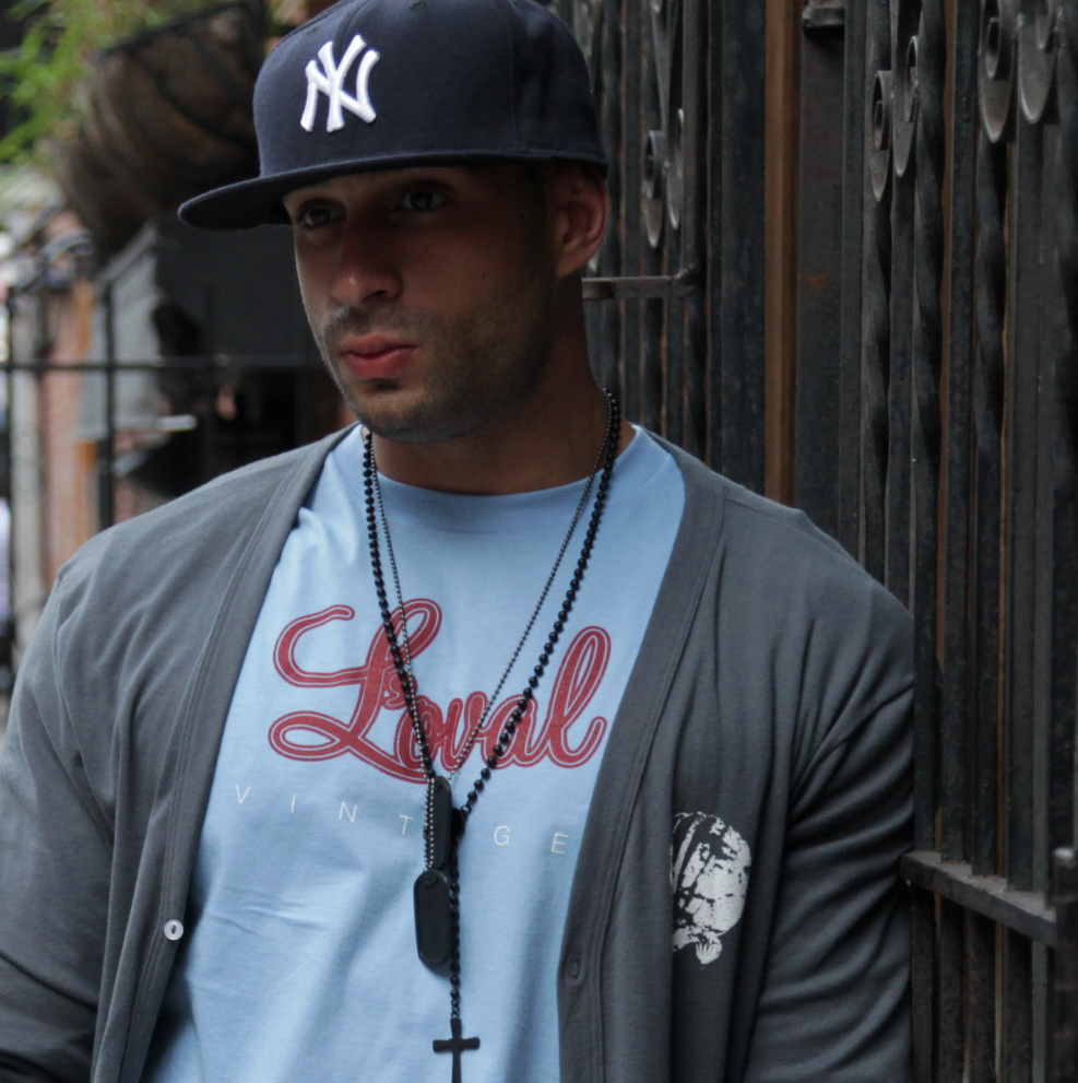
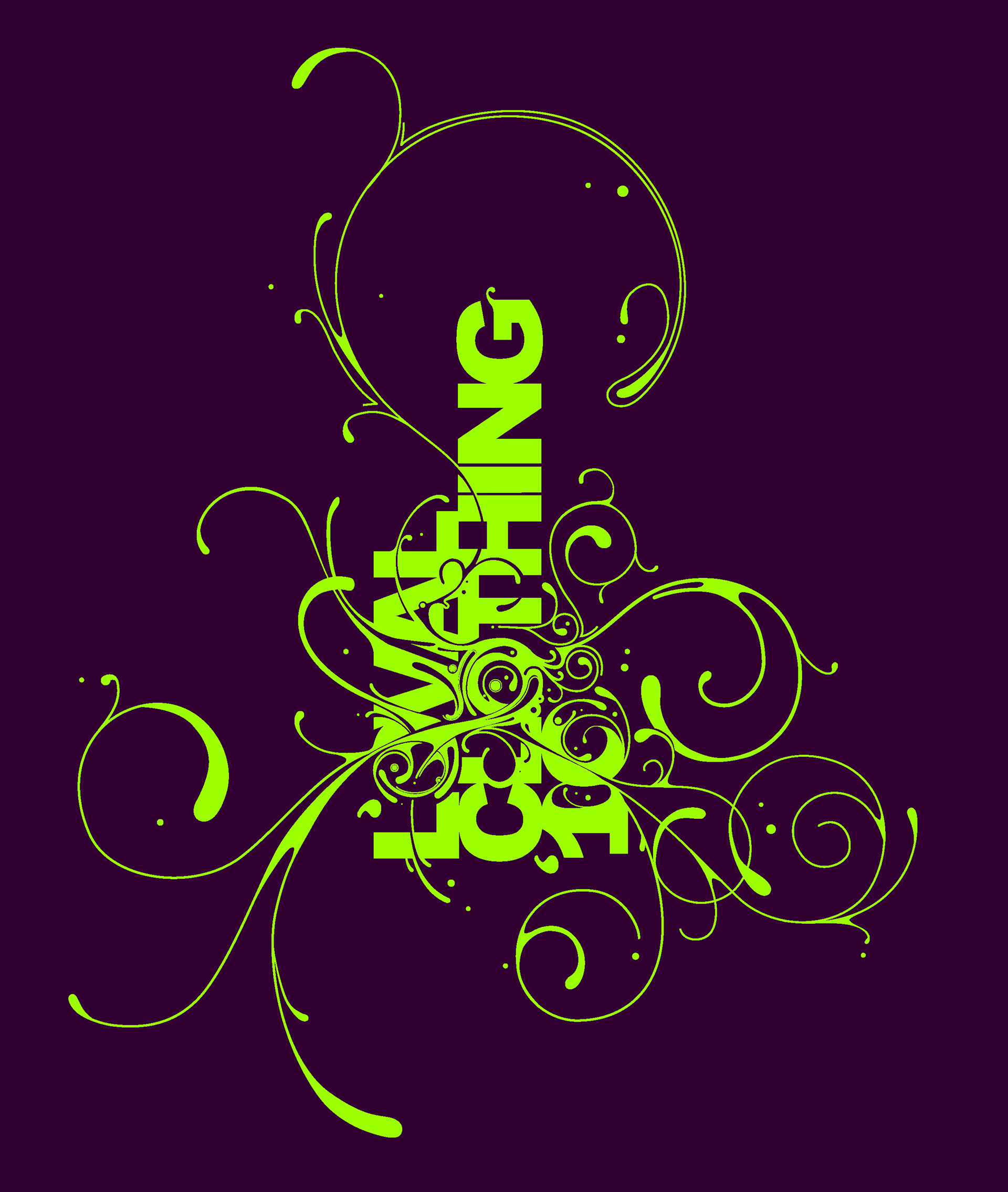
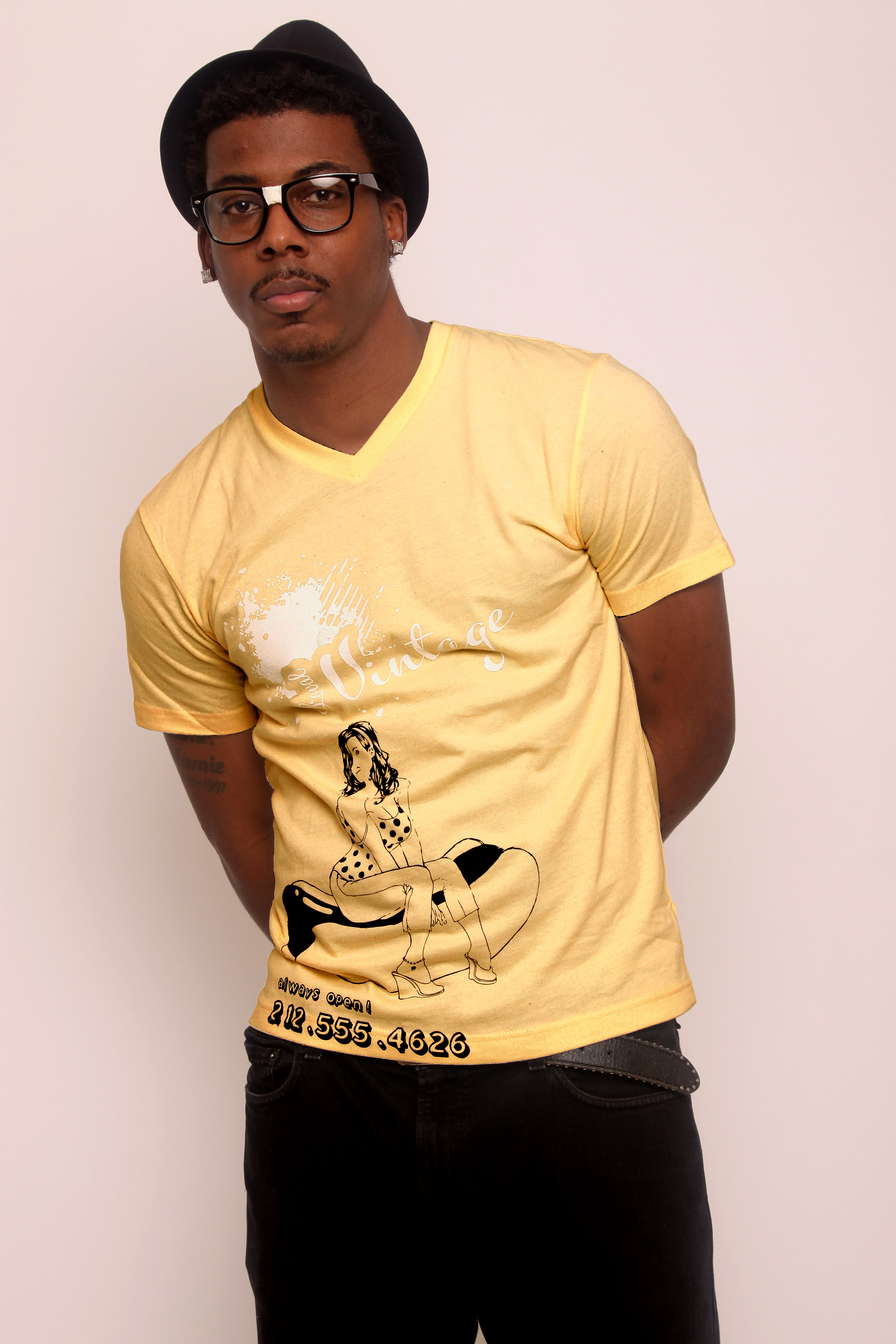
Clothing design
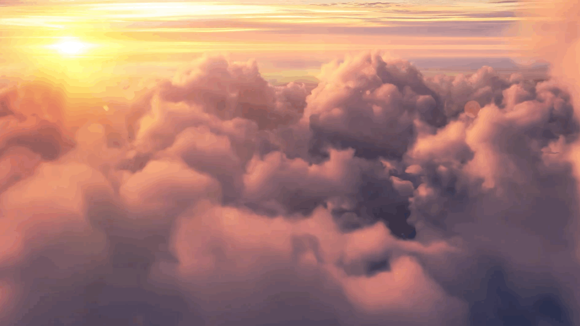
Here is where I took a chance to explore designs in and outside of the brand. I designed the clothing in "chapters", where a story is told across a complete set of shirts. I also worked with some pretty bright and vibrant colors. I wanted to maximize the probability of sales so I created the designs with the idea they would be marketed also as collectibles. In turn, most designs had variants.


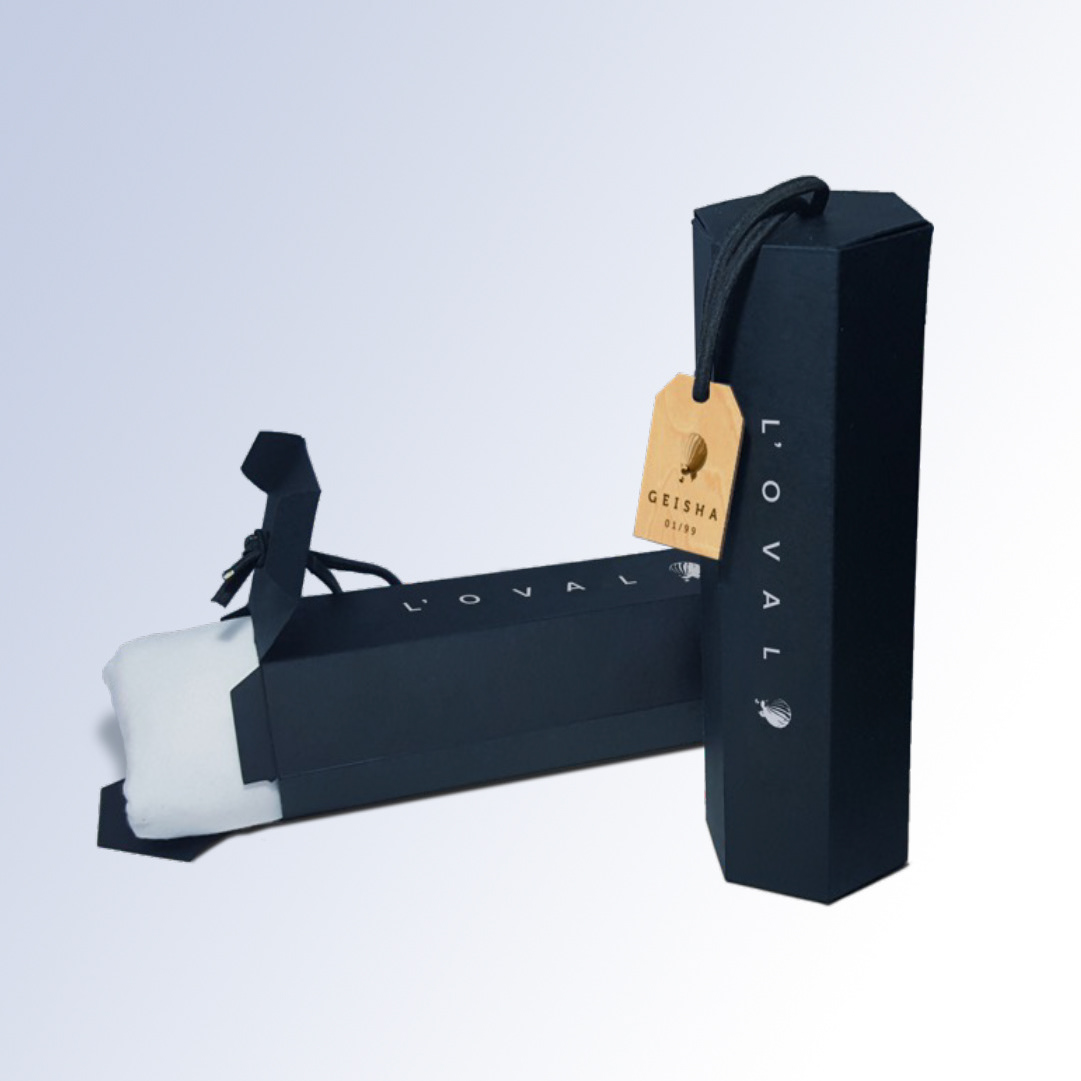
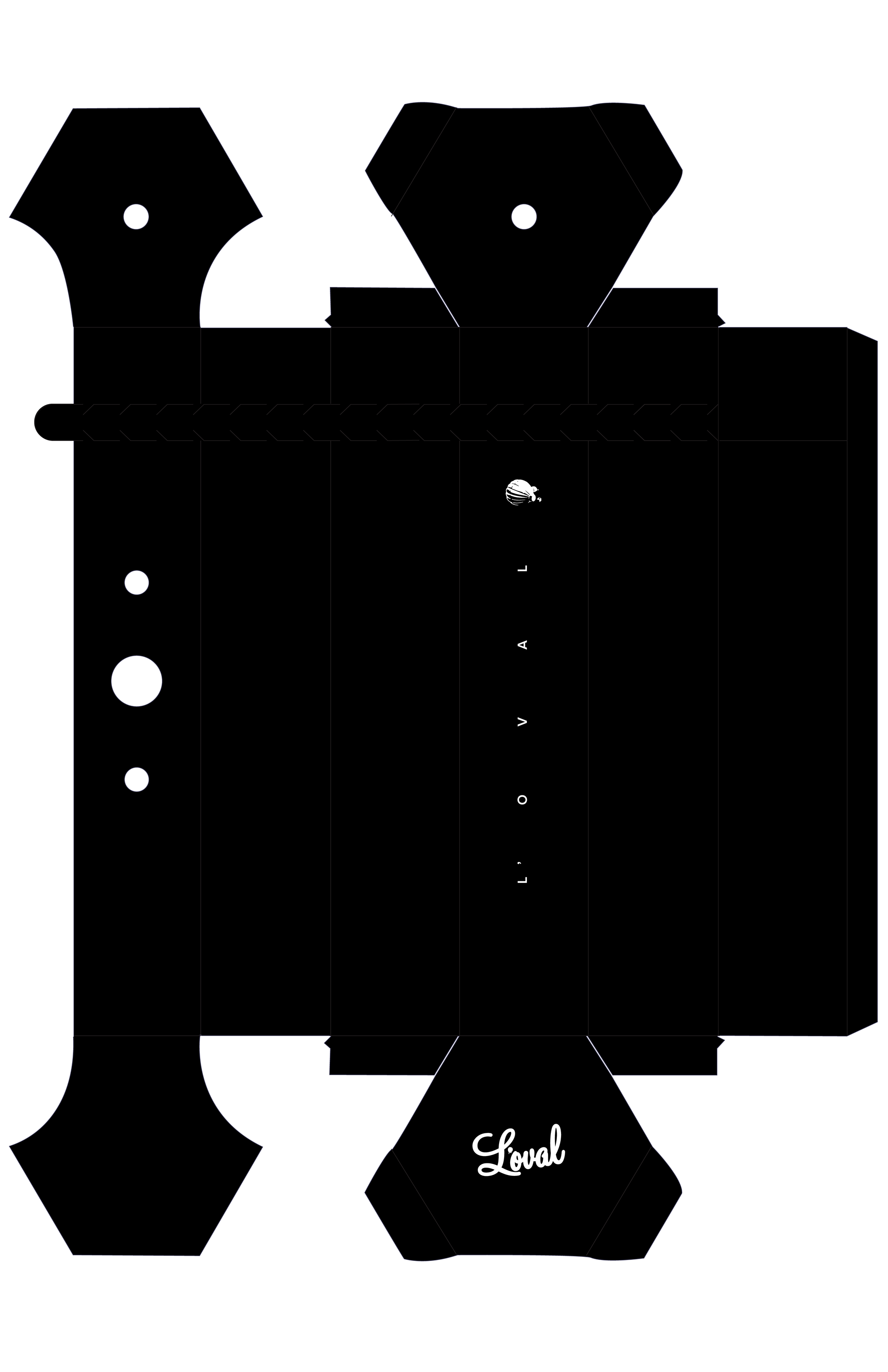
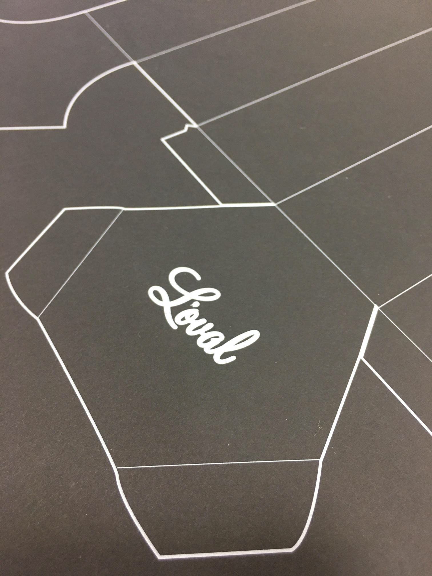
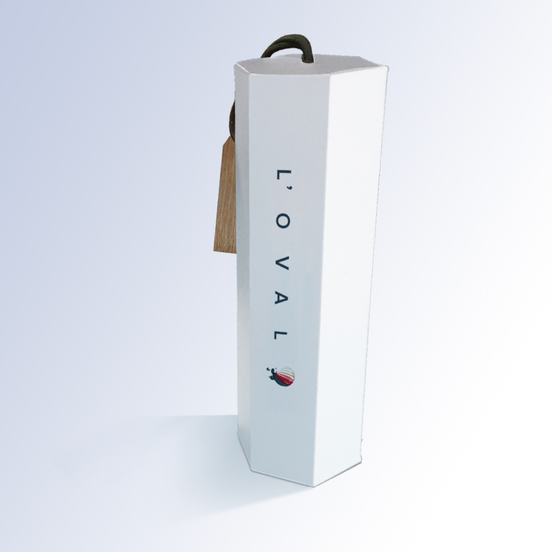
Package design
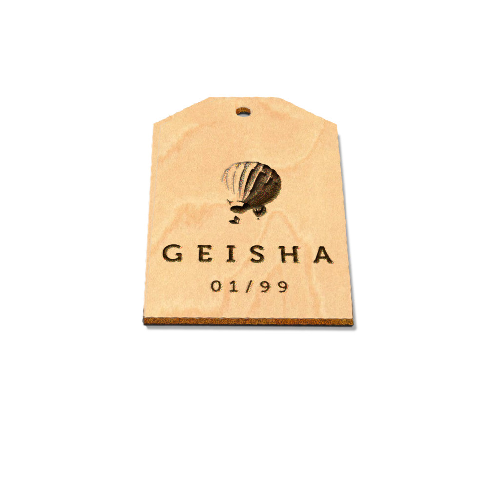
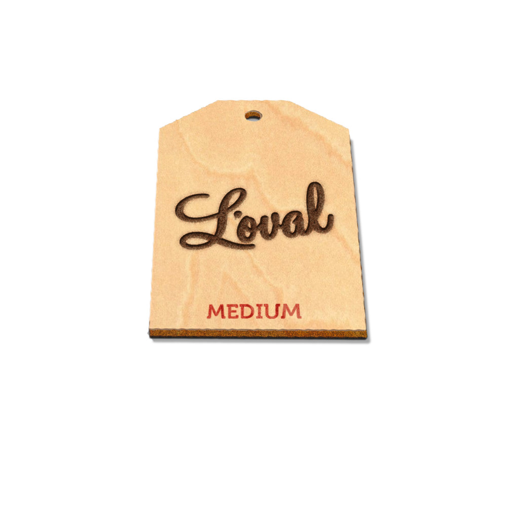
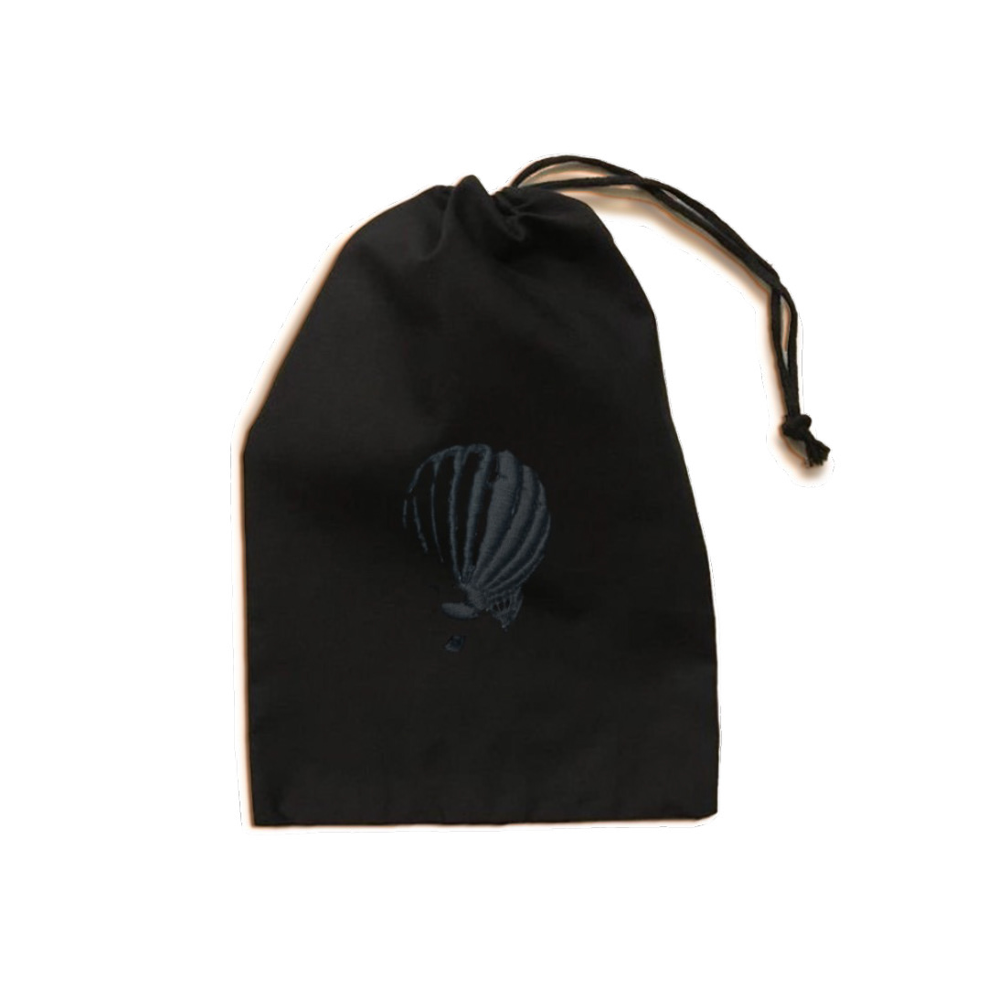
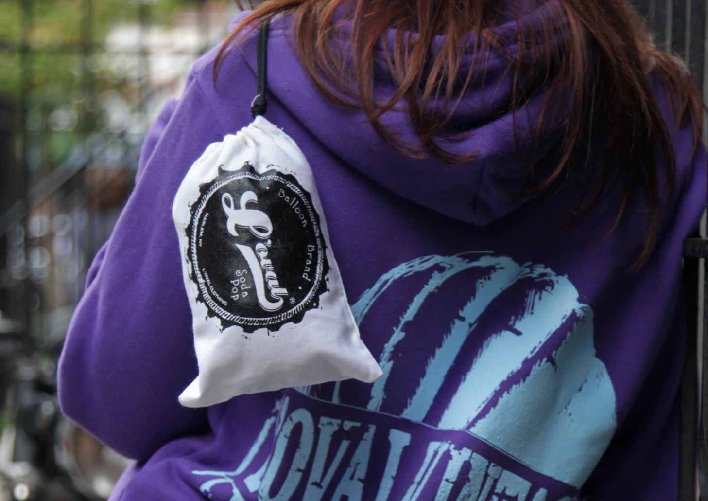
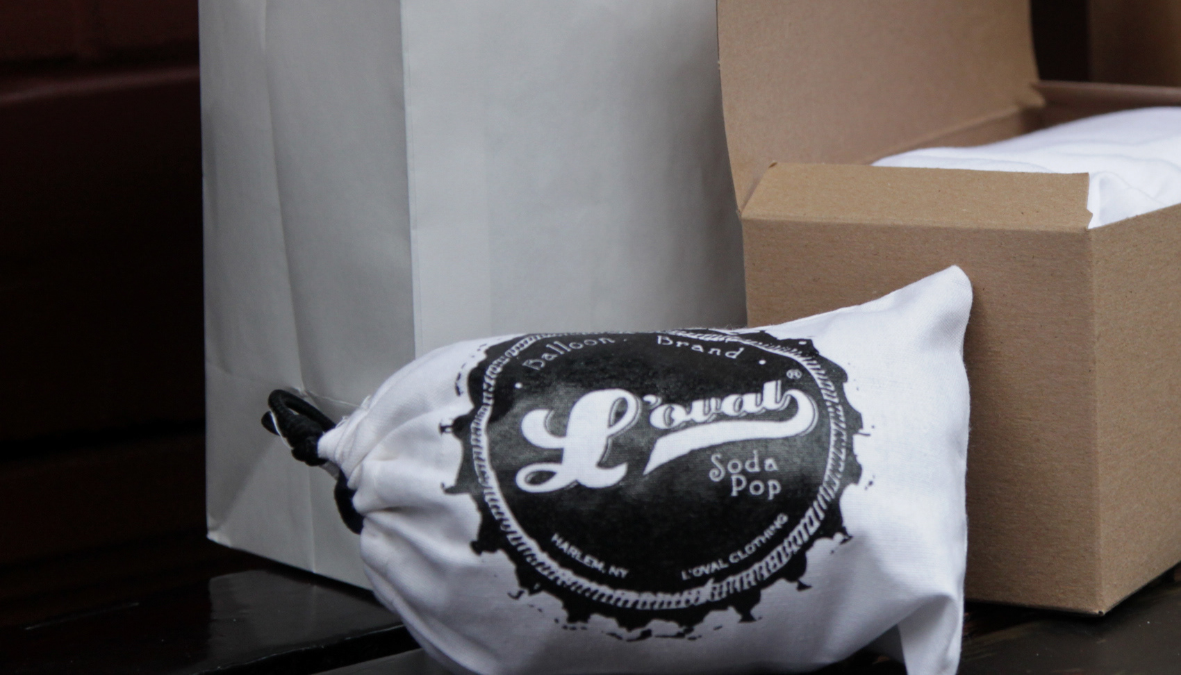
The packaging was influenced by the idea of collectibles. Each box/garment would contain a serial code for authenticity. The packaging was also created so it would need to be damaged in order to be opened. Small windows on the boxes display the color of the design, while the hang tags carry the image of the design.