
The ask
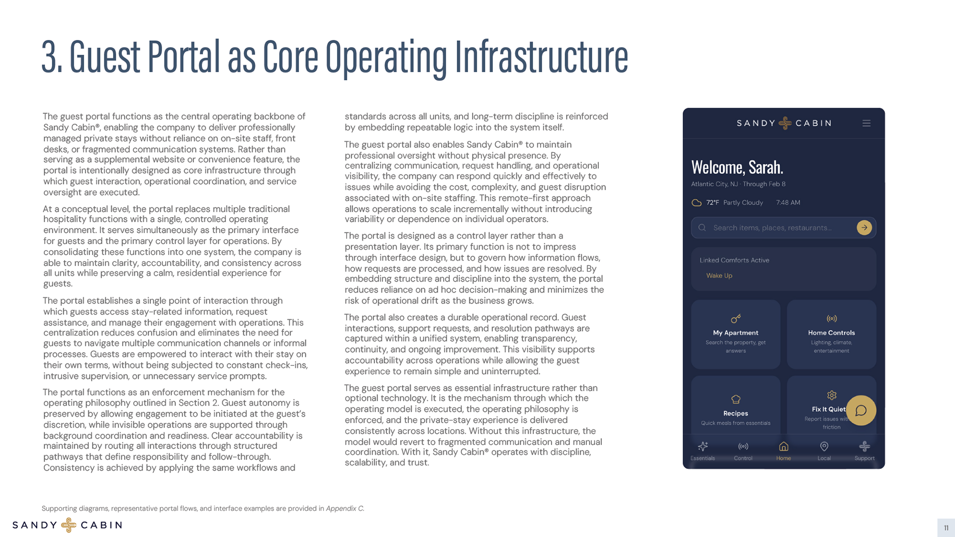
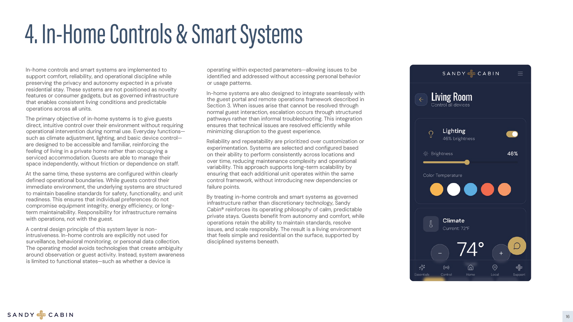
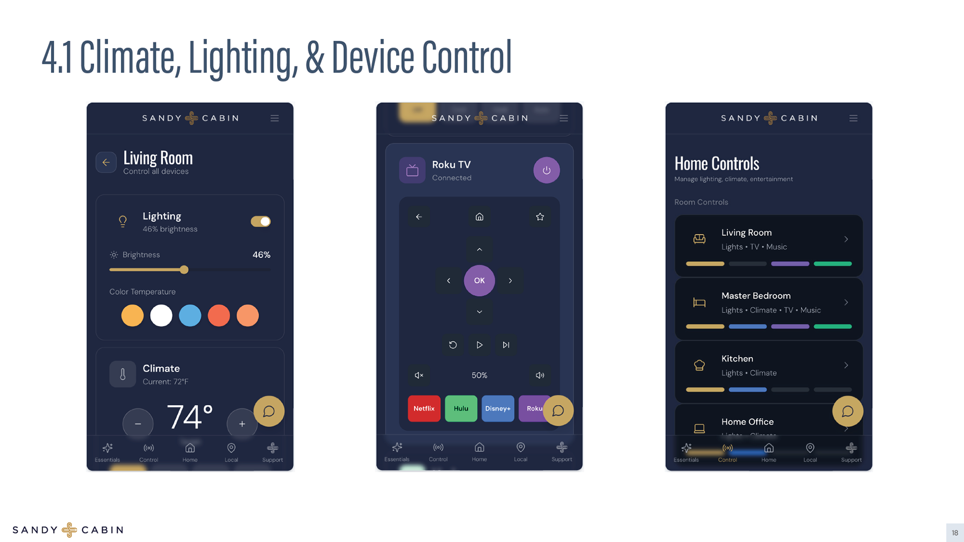
A fully conceptualized Private Stay Hospitality system developed from the ground up, beginning with category creation and ending with operational execution through a live guest portal. What started as a positioning insight (“livability after day three”) evolved into a complete brand, business model, and digital infrastructure. I created the name, cross monogram, typography system, color palette, and tone of voice, defining a calm, disciplined alternative to both hotels and typical short-term rentals. From there, I structured the entire business architecture, operating philosophy (Invisible, Predictable, Remote), financial modeling, occupancy thresholds, pricing tiers, and grant-ready documentation. The project extended into full website design and build in Wix, including unit-level booking flows and trust-forward messaging, and culminated in the execution of a centralized guest portal powered by Base44, designed to function as a digital front desk. Every layer from brand system to workflow diagrams to smart-home doctrine was intentionally aligned to reduce friction and create a scalable, professionally managed living system.
Logos
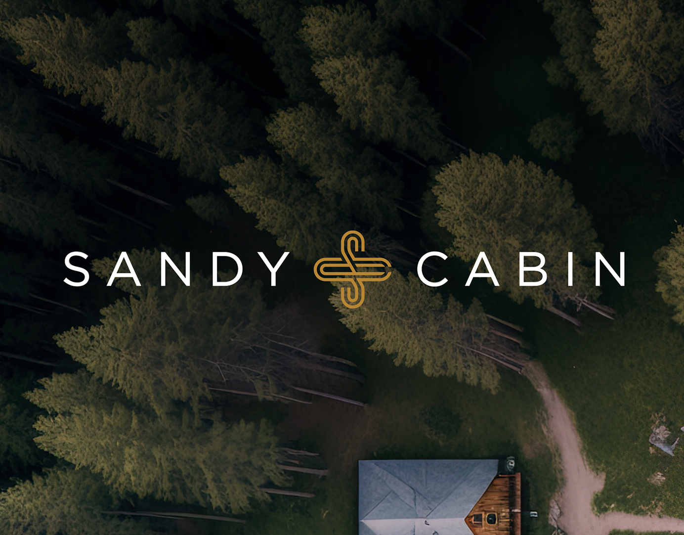
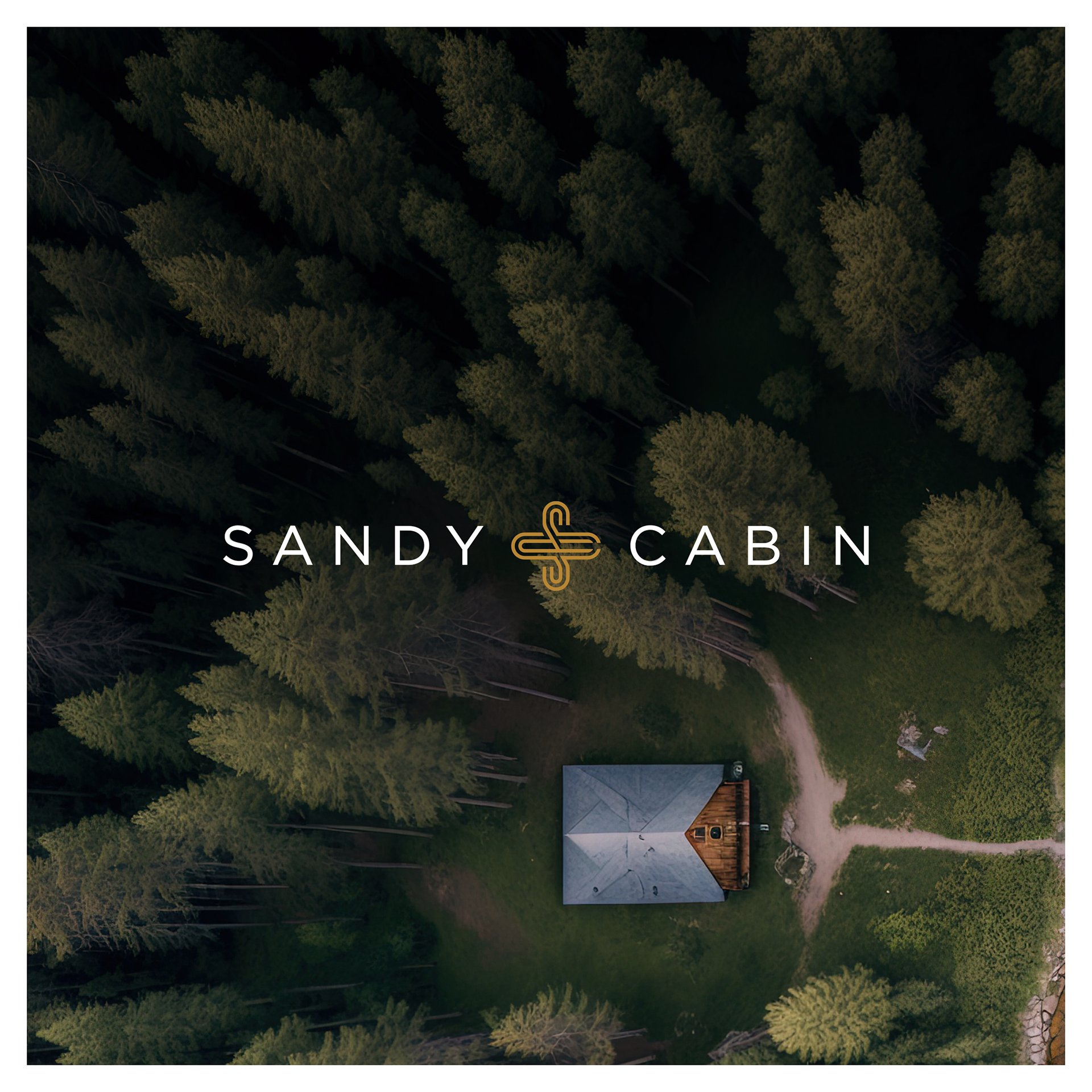
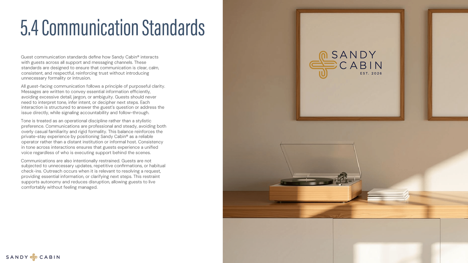
The Sandy Cabin logo centers on an interwoven S and C, forming a cross-like mark that subtly references health, well-being, and care. The shape conveys balance and support without feeling clinical; symbolizing rest, stability, and thoughtful hospitality. Paired with clean, spaced typography and a restrained navy-and-gold palette, the mark communicates a stay designed around comfort, intention, and quiet trust rather than overt luxury or ornament.
Colors
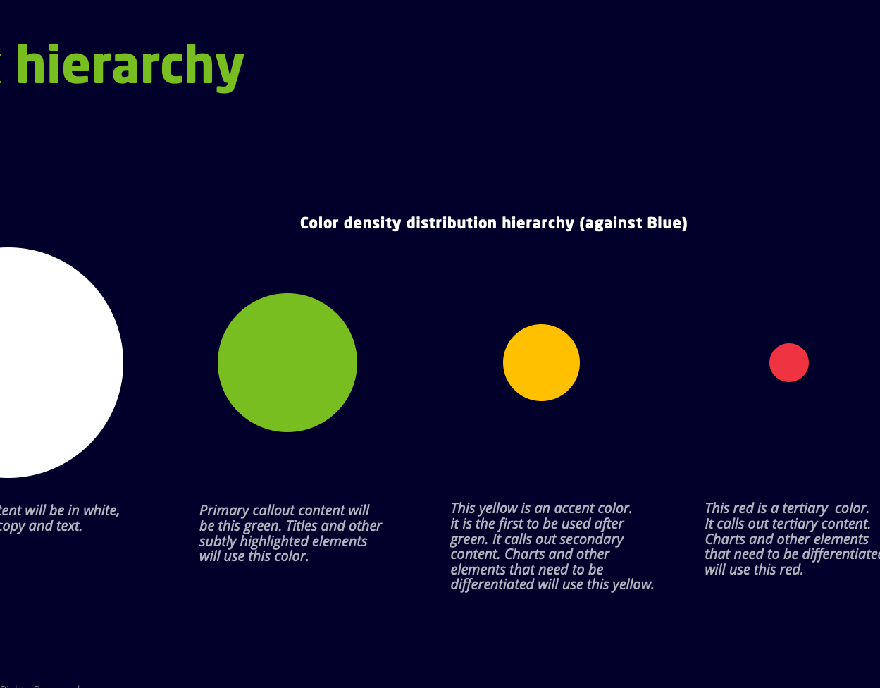
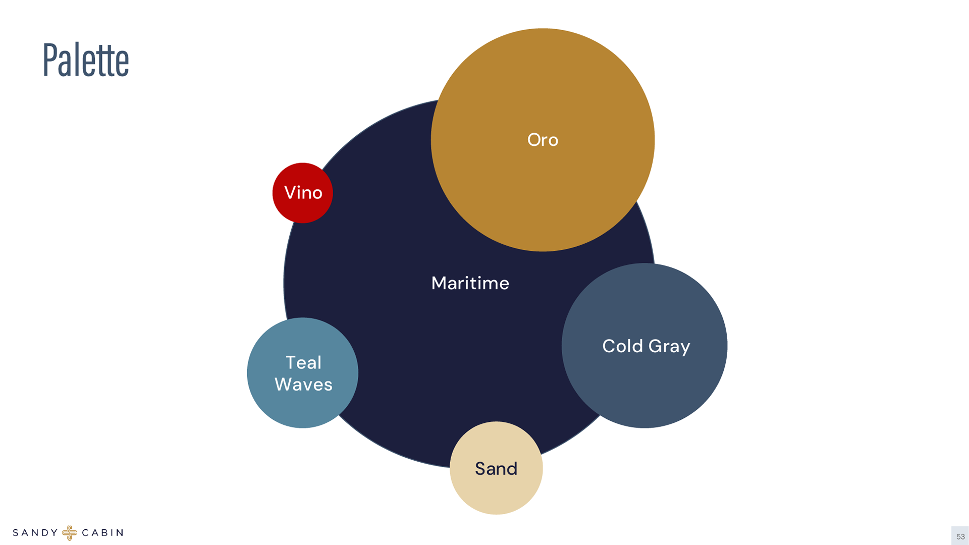
This color system is intentionally restrained, built around calm neutrals and ocean-inspired tones, with warmth used as an accent rather than a constant. Deep navy anchors the palette, conveying stability, trust, and quiet professionalism. Soft blues and teals introduce a sense of air and ease, referencing coastal light, open space, and restfulness without feeling cold or clinical. Warm sand and off-white tones soften the system, adding a lived-in, human quality that keeps the brand from feeling overly rigid. Gold is used sparingly as a signal color, representing care, quality, and attention. The red is deliberately isolated as an emergency or alert tone only, ensuring it retains impact and is never visually noisy. Together, the palette balances calm and clarity, reinforcing a feeling of comfort, control, and thoughtful hospitality.
Business Plan
The business plan I developed from the ground up, where strategy and visual identity were built simultaneously. I created the name, logo system, color palette, typography hierarchy, and brand voice to support a new category I defined as “Private Stay Hospitality.” The restrained palette and calm typographic structure were designed to communicate professionalism, privacy, and operational discipline, positioning the company against mid-tier hotels rather than typical short-term rentals. Beyond visual identity, I structured the entire business plan architecture, aligning brand decisions with financial modeling, operational workflows, and technology infrastructure. Every design choice from tone (“Live life here.”) to layout structure reinforces the core doctrine of livability, making the brand feel less like hospitality marketing and more like a reliable living system.
The business plan I developed from the ground up, where strategy and visual identity were built simultaneously. I created the name, logo system, color palette, typography hierarchy, and brand voice to support a new category I defined as “Private Stay Hospitality.” The restrained palette and calm typographic structure were designed to communicate professionalism, privacy, and operational discipline, positioning the company against mid-tier hotels rather than typical short-term rentals. Beyond visual identity, I structured the entire business plan architecture, aligning brand decisions with financial modeling, operational workflows, and technology infrastructure. Every design choice from tone (“Live life here.”) to layout structure reinforces the core doctrine of livability, making the brand feel less like hospitality marketing and more like a reliable living system.


Website home page
The website was designed as a direct extension of the business doctrine—calm, structured, and operationally intentional. I developed the full digital experience in Wix, translating the brand system (logo, diamond mark, typography hierarchy, and restrained color palette) into a living interface that mirrors the company’s “Invisible, Predictable, Remote” philosophy. The hero statement, “Live life here,” anchors the tone, while the layout architecture prioritizes clarity over clutter: defined sections, soft contrast, controlled spacing, and intuitive navigation. I designed the unit pages, booking interface integration, and microsite logic to reduce friction and anxiety, reinforcing the idea of livability after day three rather than short-term hospitality hype. Systems like the Linked Comforts feature, health and well-being modules, and smart home explanations were crafted to communicate comfort without surveillance, technology without complexity, and professionalism without corporate stiffness. The result is a brand site that feels less like a vacation rental page and more like a stable living system; measured, modern, and quietly confident.