
Brand guidelines layout

Typography
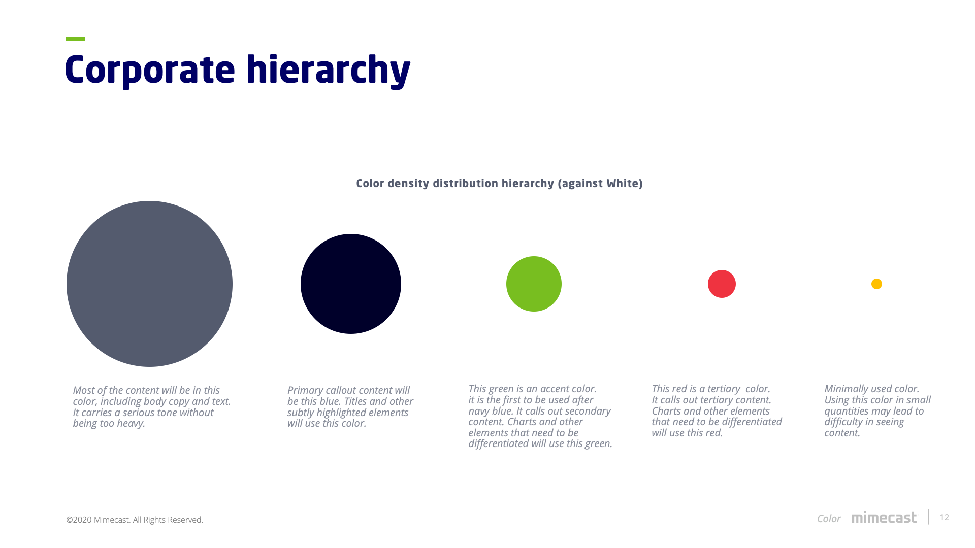
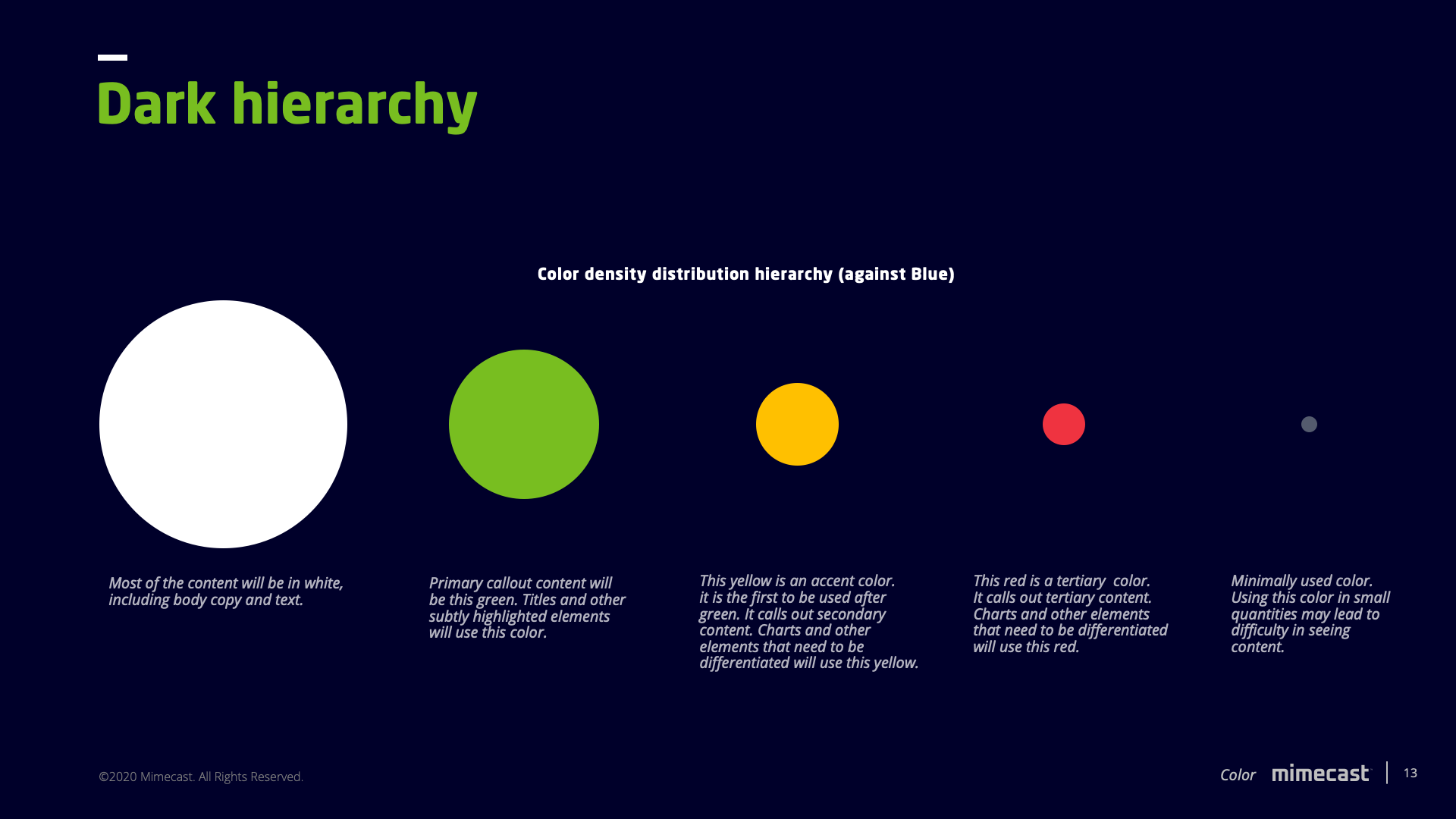
Color theory
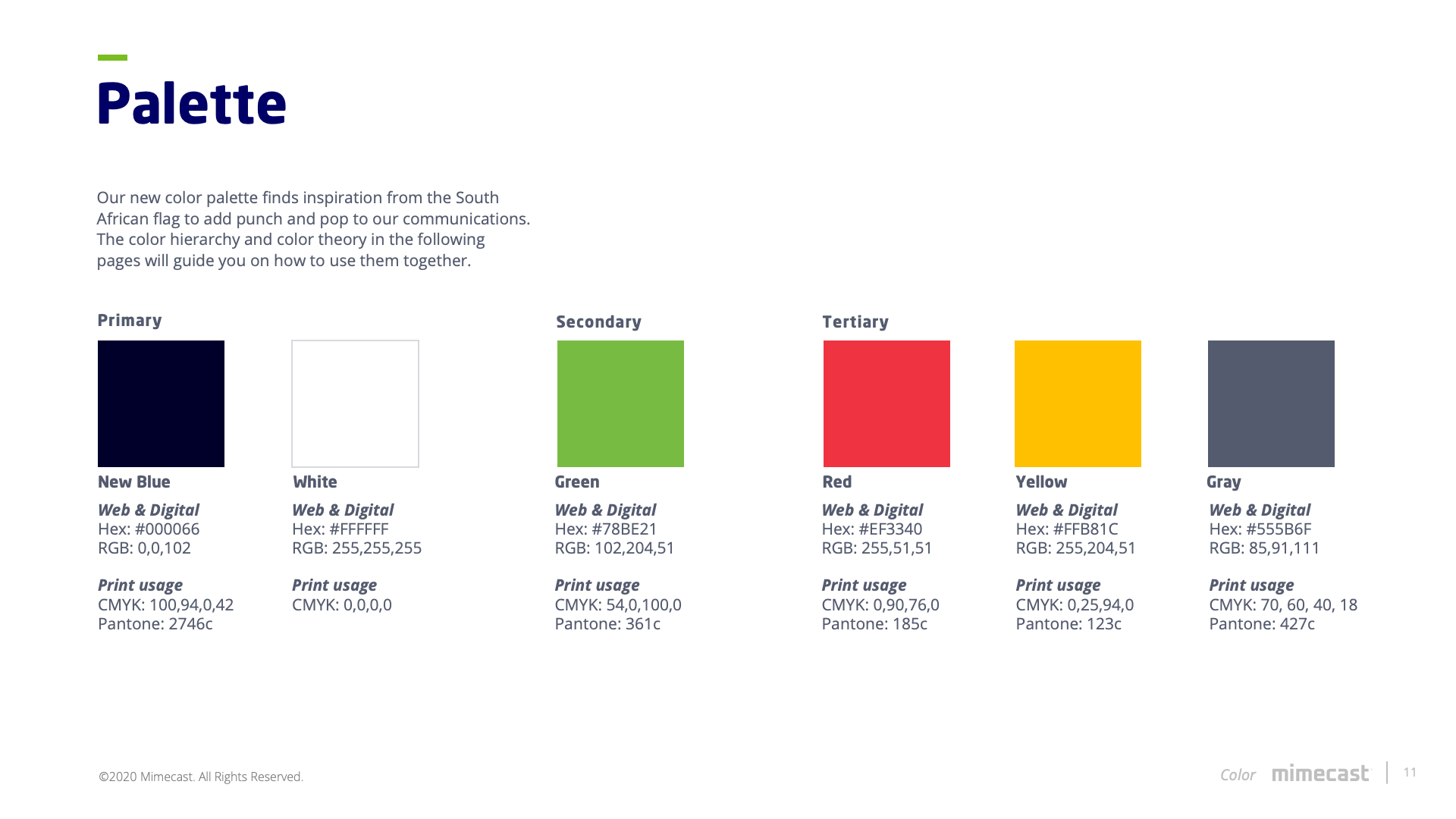
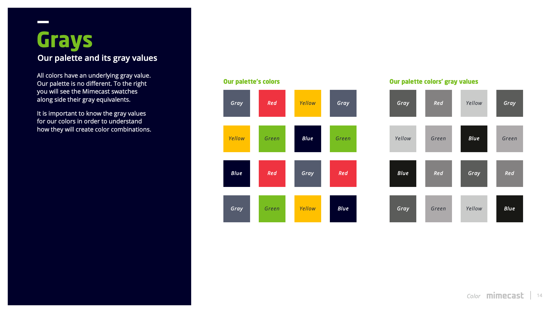
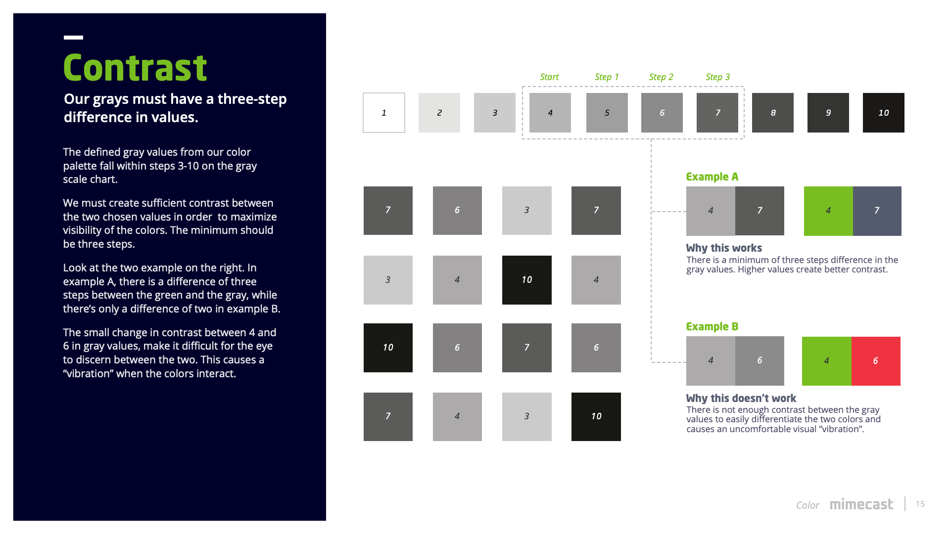
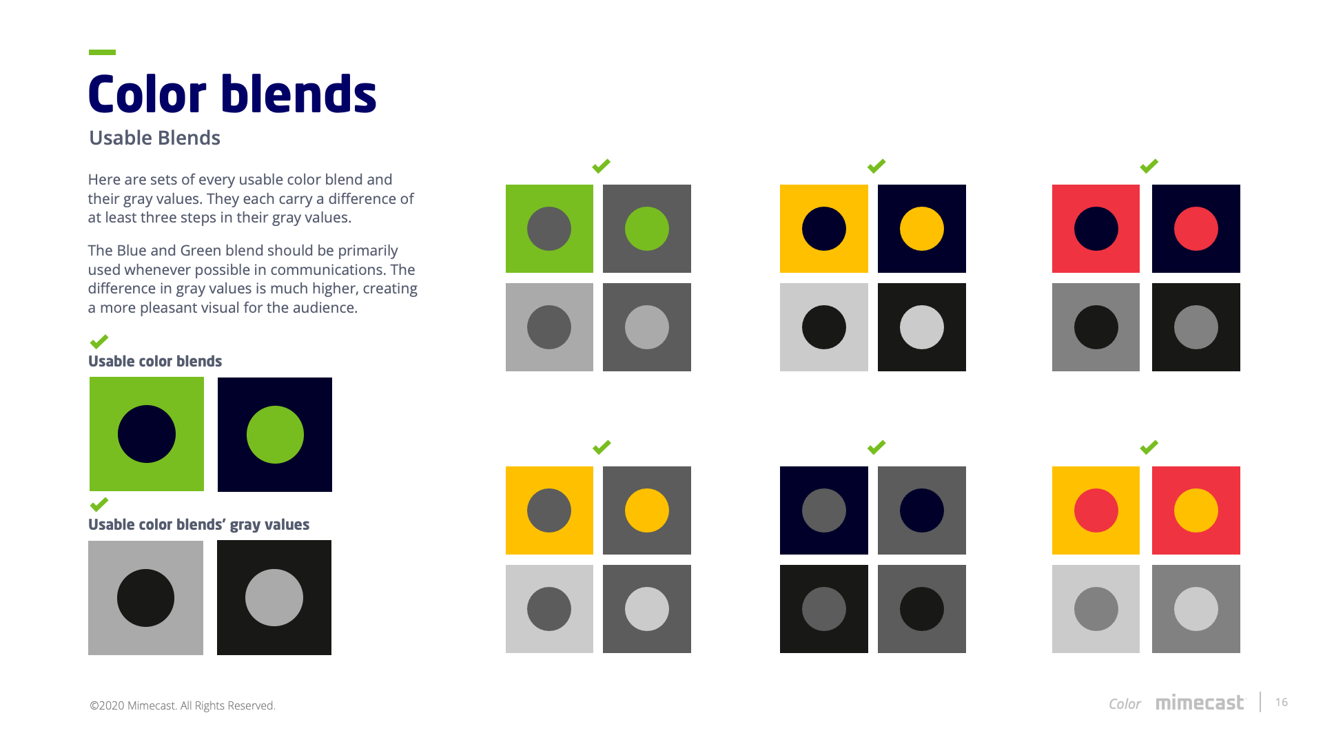
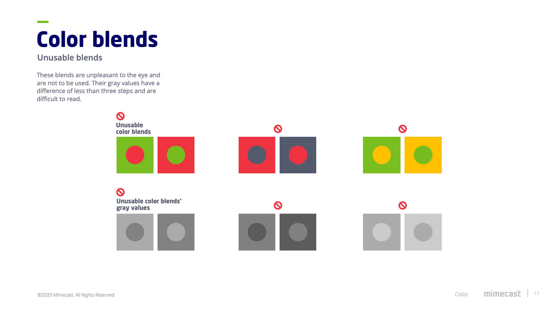
Working with the Creative director I replaced a couple of the palette colors. I didn't see an anchor color, and the palette seemed to clash with itself. The original blue was too bright, slightly darker than a royal. Instead, I went with this navy color which would serve as a contrast to the bright secondary colors. There also needed to be interactivity between the existing colors, but without a set of rules, they wouldn't play nice. Thus this solution.